
Create Site Form
Overview
The Site Forms module allows Administrators to create and manage custom forms that can be embedded into website pages.
All submitted form data is stored in Ark and can be viewed from the Site Forms module.
Each form is built by combining different form components, allowing Administrators to create forms that meet their specific business requirements.
1. Site Form Listing
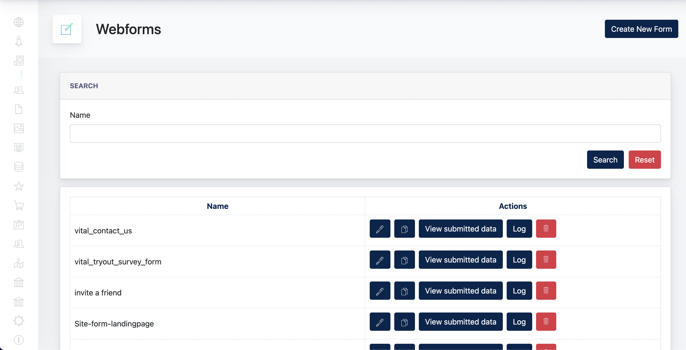
The Site Form Listing page provides an overview of all forms created in Ark. From this page, Administrators can search, manage and monitor existing forms.
Administrators can perform the following actions:
| Function | Description |
|---|---|
| Search | Search for a form by its name. |
| Create New Form | Create a new site form. |
| Edit | Modify an existing site form. |
| Duplicate | Create a copy of an existing form. |
| View Submitted Data | View all submissions received for the selected form. |
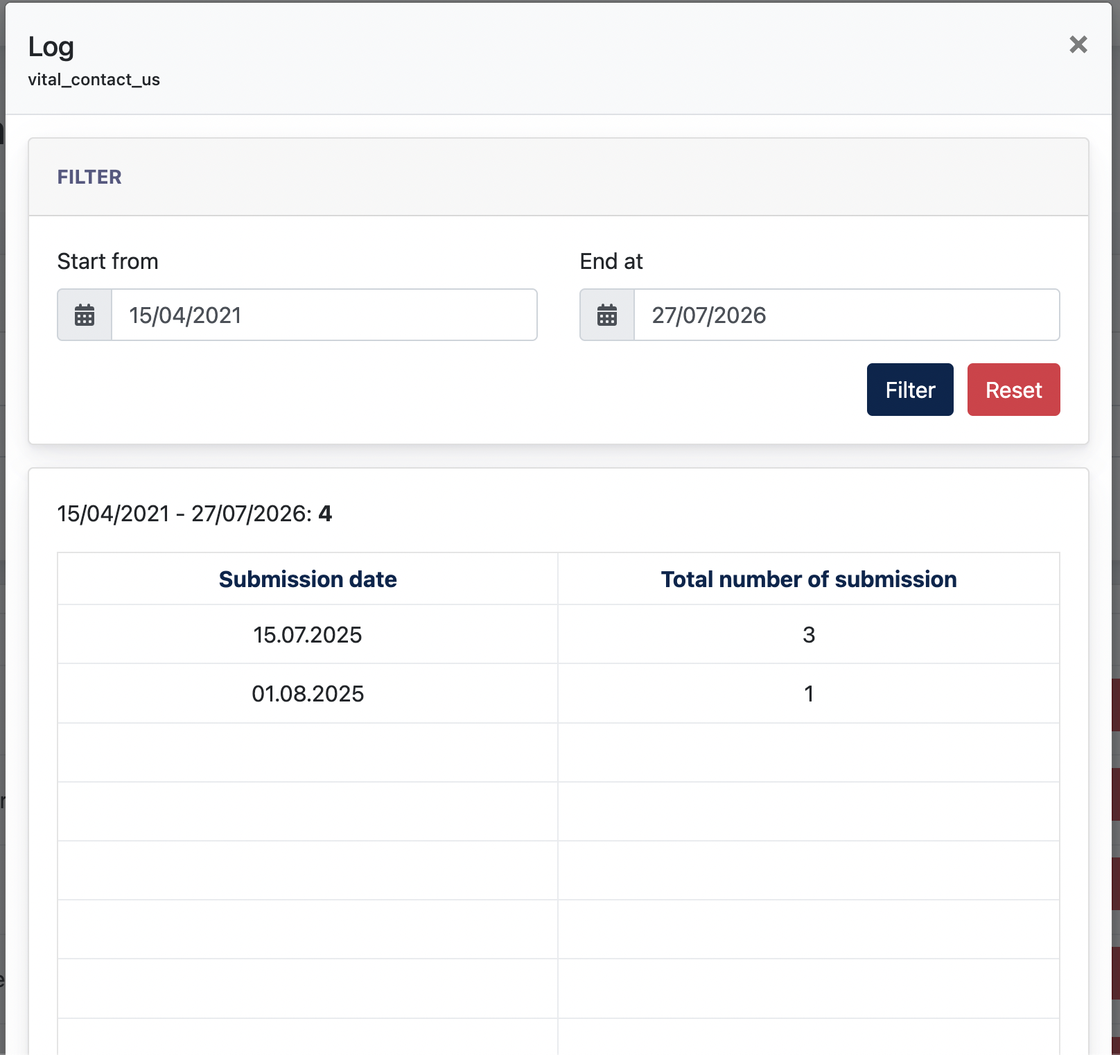
| Log | View a summary of form submissions grouped by date within a selected date range. This feature is intended for monitoring submission activity. |
| Delete | Permanently remove the selected form. |
Screenshot of "Log":
2. Create New Form
To create a new site form, click Create New Form from the Site Forms listing page.
The form editor consists of four configuration tabs:
- General – Configure the form settings, appearance, and form content.
- Email – Configure email notifications sent after a form submission.
- Marketing Funnel – Configure Marketing Funnel integration (available only when the Marketing Funnel module is subscribed).
- Newsletters – Configure Newsletter integration (available only when the Newsletter module is subscribed).
2.1 General Tab
Configure the basic settings, appearance, and content of the site form.
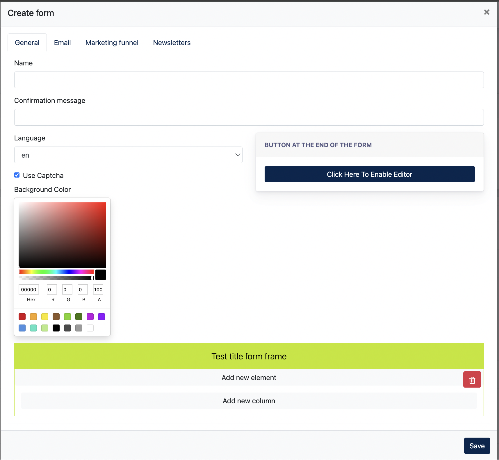
| Field | Description |
|---|---|
| Name | Enter a unique name to identify the form in the Site Forms listing. This name is for administration purposes only and is not displayed to website visitors. |
| Confirmation Message | Enter the message displayed to visitors after a successful form submission. |
| Language | Select the language used for the form. |
| Use Captcha | Enable CAPTCHA verification to help prevent spam submissions. |
| Background Color | Select the background colour of the form. |
| Button at the End of the Form | Configure the submit button displayed at the bottom of the form using the built-in button editor. |
| Form Builder | Design the form by adding rows, columns, and form components. Components can be arranged and customised to suit the desired layout. |
2.2 Email Tab
The Email tab allows Admin to configure the email notifications sent when a visitor submits the form. Separate email templates can be configured for the form recipient and the form sender.
| Field | Description |
|---|---|
| Email Recipients | Enter one or more recipient email addresses that should receive notifications when the form is submitted. Separate multiple email addresses using a semicolon (;). |
| BCC Email Address | Enter one or more BCC email addresses to receive a blind copy of the notification email. Separate multiple email addresses using a semicolon (;). |
| Email Subjects | Enter the subject line for the notification email sent to the recipients. |
| Email Content | Compose the email body that will be sent to the configured recipients when the form is submitted. Supports rich text formatting and multilingual content. |
| Email Content for Form Sender | Compose the email that will be sent to the visitor after a successful form submission. Supports rich text formatting and multilingual content. |
Note: Visitors who provide an email address in the form will automatically receive a copy of their submission.
2.3 Marketing Funnel and Newsletter Tab
The Marketing Funnel and Newsletters tabs are only available when the respective modules are subscribed. Their configuration is covered in the corresponding Marketing Funnel and Newsletter chapters of this manual.
2.4 Form Components
Click "Add New Element"
Center
Select a component to add to the form:
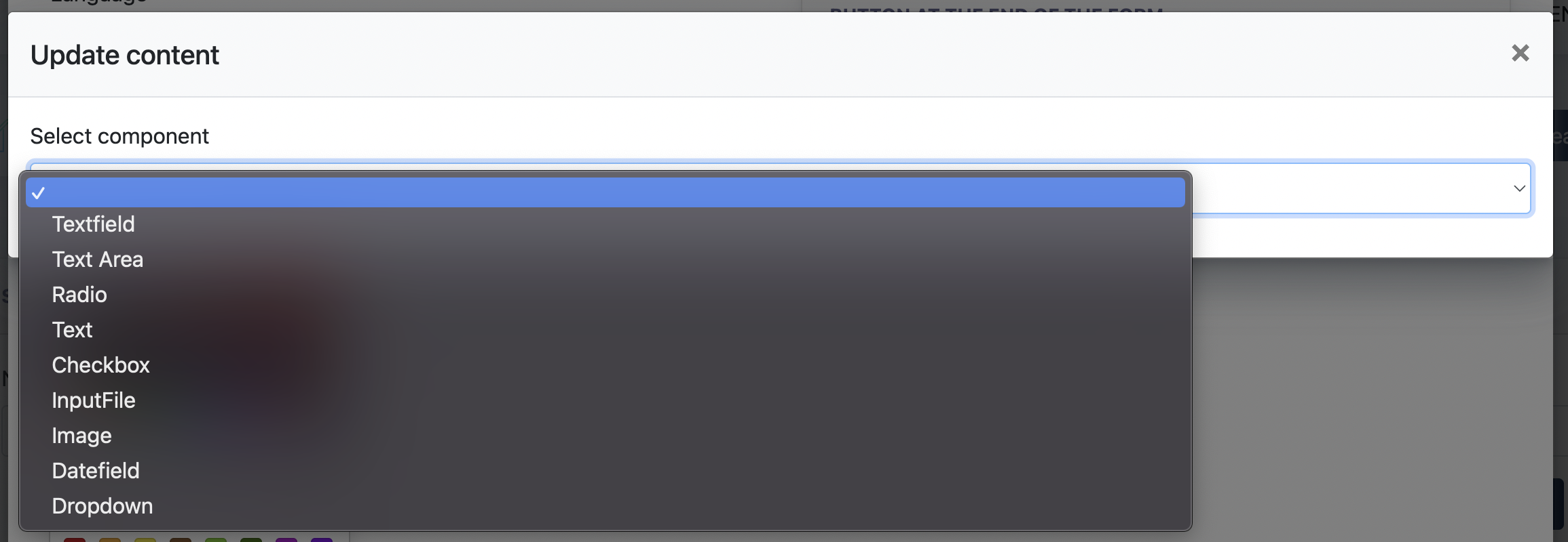
After adding a component to the form, click the Edit icon to configure its settings.
Each component opens a configuration dialog where you can deletecustomise field/its addappearance fieldsand ifbehaviour. While the available settings vary depending on the selected component type, most components provide options such as labels, layout, validation, and display settings.
Note: The available configuration options depend on the selected component. This manual focuses on the purpose of each component rather than documenting every individual configuration option.
Available Form Components :
| Component | Description |
|---|---|
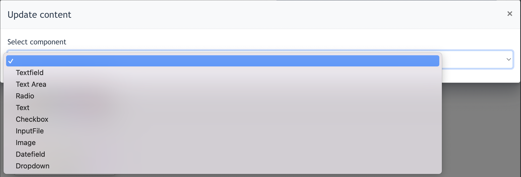
| Textfield | A single-line input field used for short text such as names, email addresses or phone numbers. |
| Text Area | A multi-line input field for longer responses, comments or messages. |
| Radio | Displays a list of options where the user can select one option only. |
| Text | Displays static text such as instructions, descriptions or headings. No user input is required. |
| Checkbox | Allows users to select one or more options or acknowledge a statement, such as accepting Terms & Conditions. |
| InputFile | Allows users to upload one or more files as part of the form submission. |
| Image | Displays an image within the form for branding, illustration or additional information. |
| Datefield | Allows users to select a date using a date picker. |
| Dropdown | Displays a list of predefined options from which users select a single value. |
After a component is added, Admin clicks "Edit" to further configure each component's layout and details.
The available configuration options depend on the selected component. This manual focuses on the purpose of each component rather than documenting every individual configuration option.
How to insert a Contact Form to a web page :
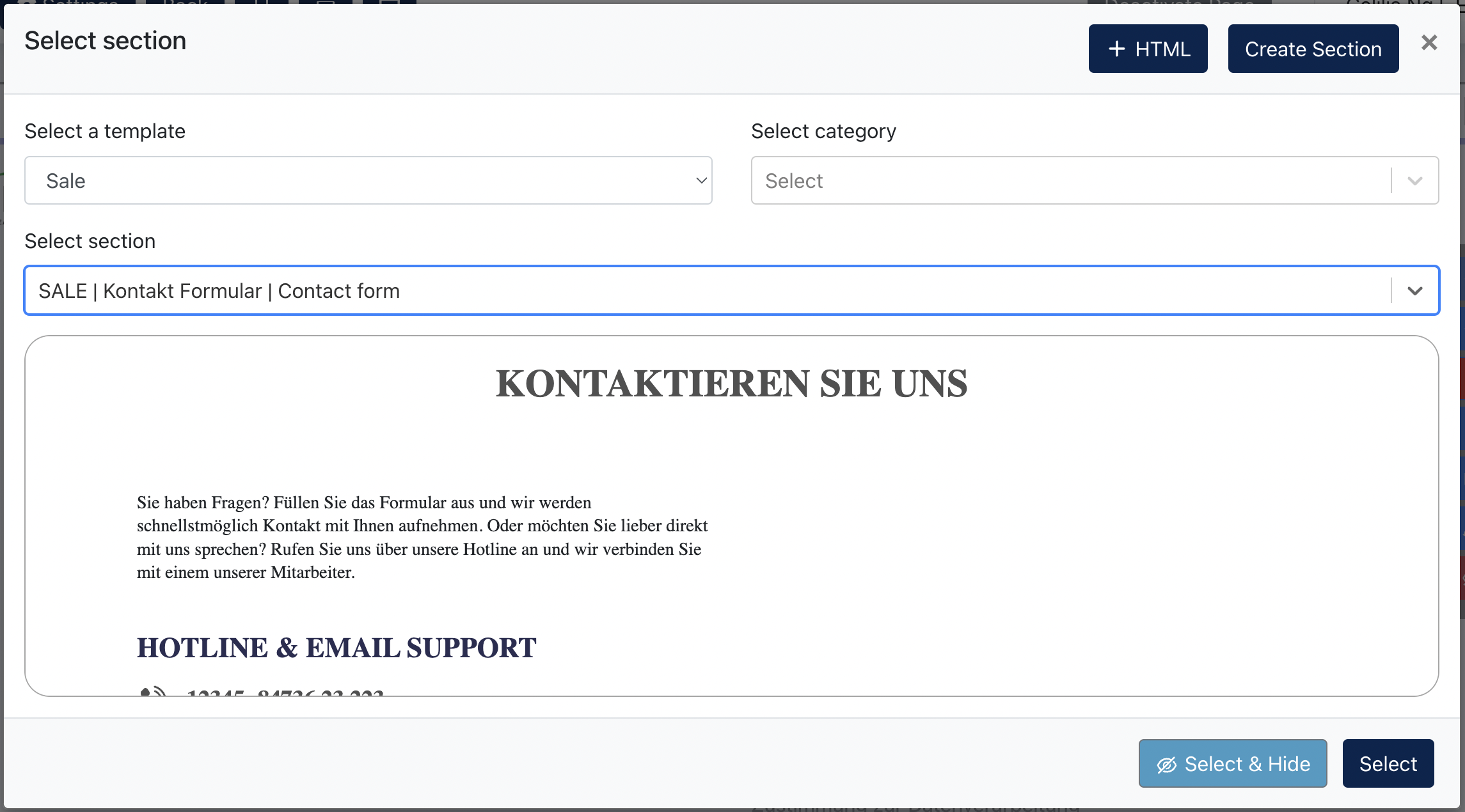
Go to [ Edit Page ] and click on the [ + ] button of the section's toolbar.
Select Section "Contact Form". This modal will appear:
Click on [ Edit ] button to edit this section:
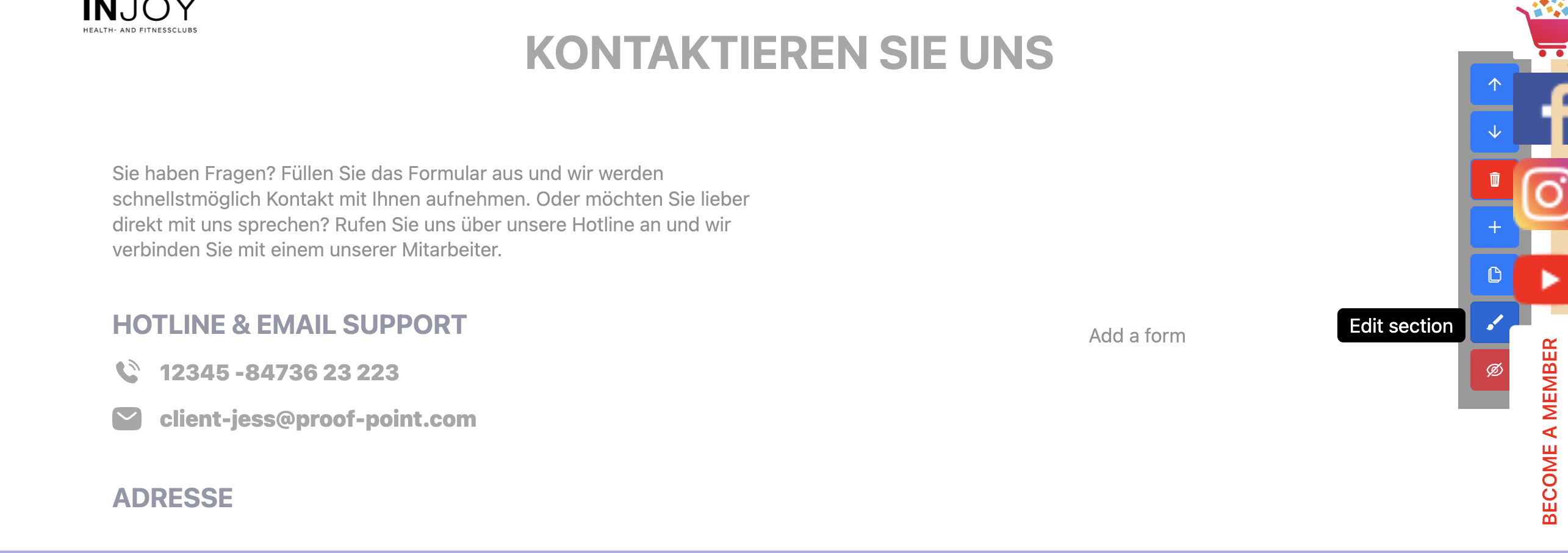
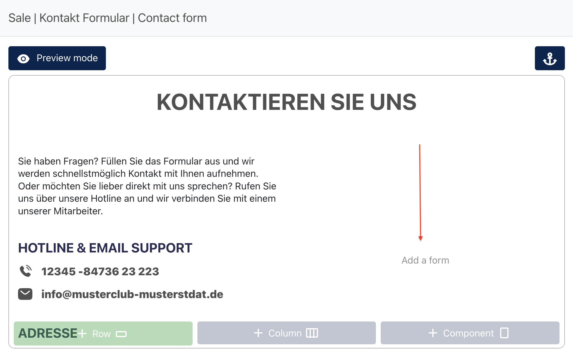
Click "Add a form"
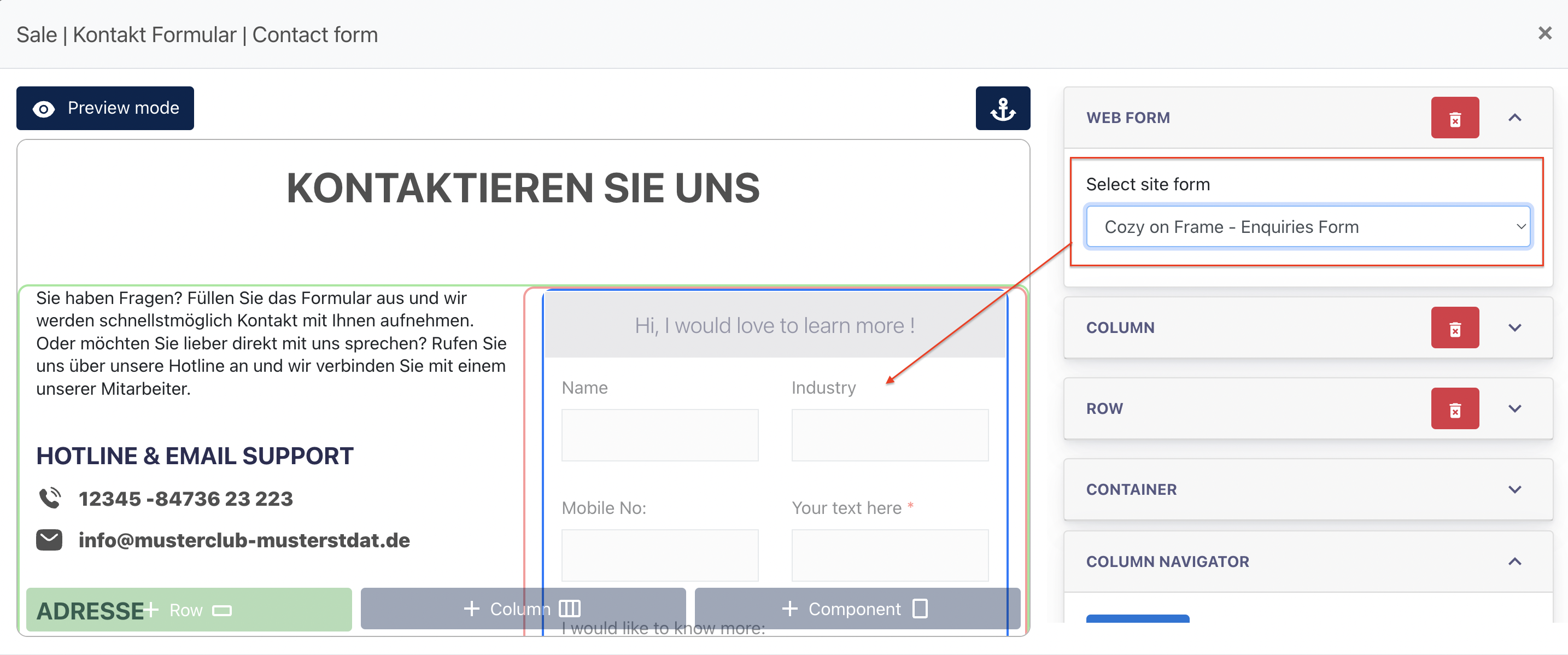
On the form drop-down, select the form which has been built earlier, and the form will be displayed on the section.
Creating a form
Go to Site forms page and clicks on "Create New form" button

You will open up a "Create Form Modal"
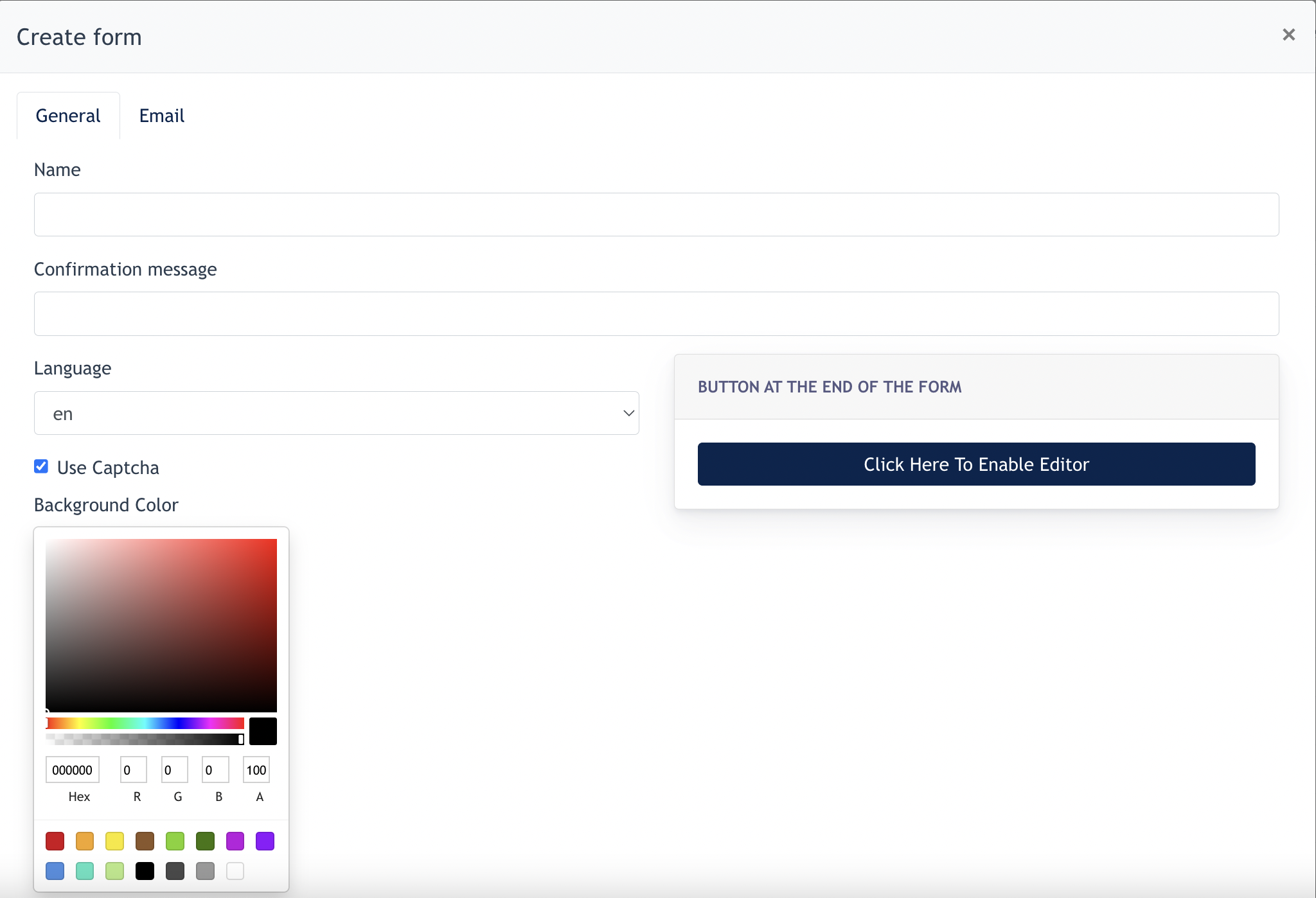
In the form :
- Name - Form’s name
- Confirmation message - the message displayed after a form's submission.
- Language - Language setting for this form
- Background colour - form’s background colour, it is white by default.
- Buttons configuration - choose this option if user like to change the looks of the button and its behaviour after clicking the button

- Test title form frame - Title of the form appearing on website
- Add new elements - click to add form's element
- Add new column - click to add another column
Email Tab
Under the [ Email tab ], Center Admin is allowed to configure the following :
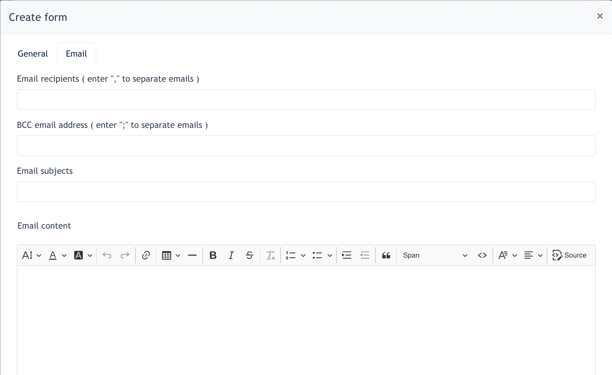
In the form :
- Email Recipient - configure who will receive an confirmation email when a user submit a form
- BCC Email Address - configure which email is BCC to when a user submit a form
- Remarks : above two configuration is for Center Admin to determine which employee in the company should take care of this form's submission, so they will be notified with an email when a user submit a form via website.
- Email Subjects - Subject of the email
- Email Content - Email content shown to email recipient ( usually is employee of company )
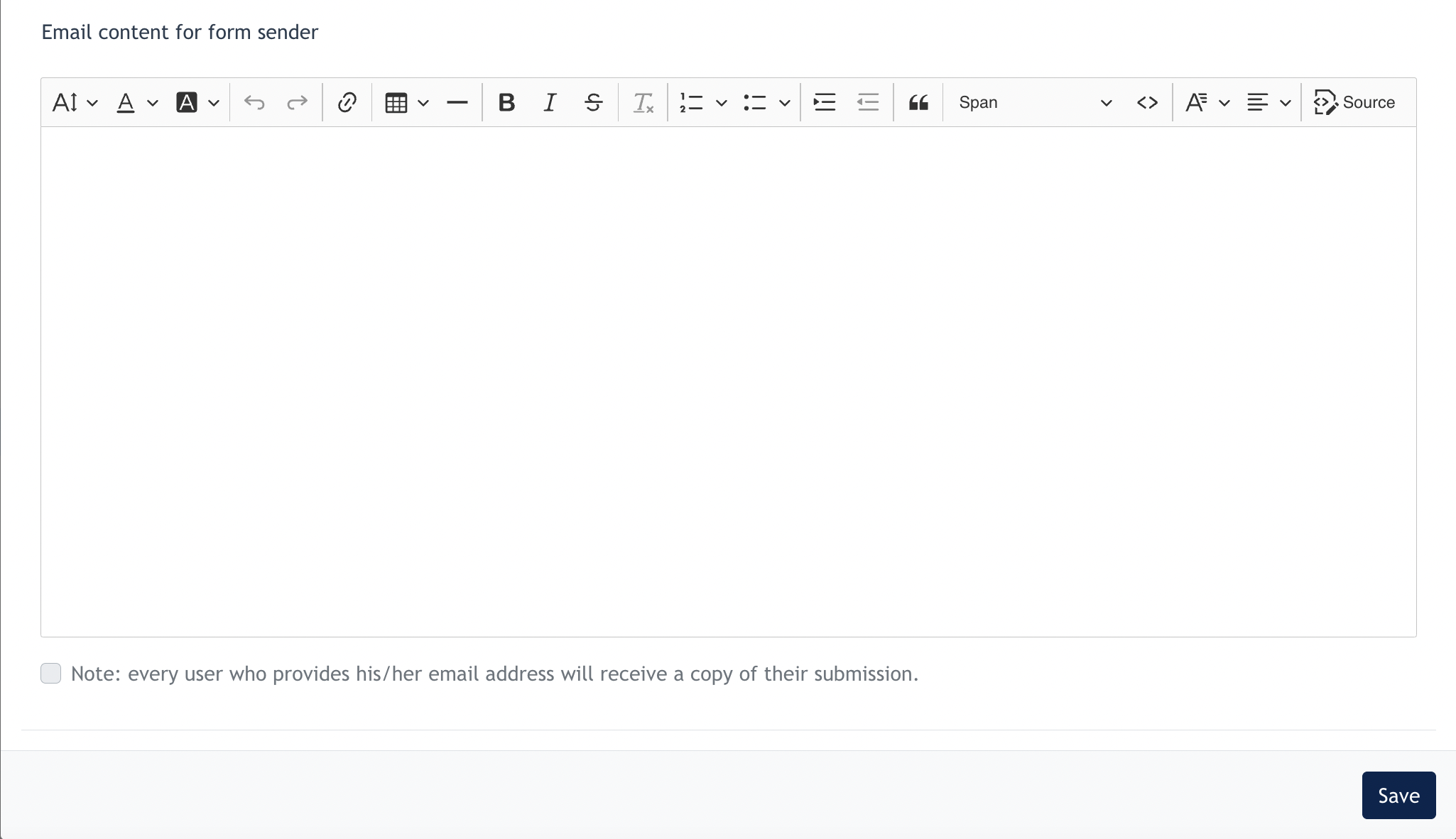
- Email Content for Form Sender - Email content shown to site form sender ( usually is site visitor )
- Checkbox of [ Note: every user who provides his/her email address will receive a copy of their submission ] - This is automatically checked when a site form consists of an Email field.
Steps to create Forms
After the above is configured, you may now create the site from using the elements provided.
First, click on "Add new element"

Next select the component via the dropdown menu.
1. Textfield
Text field component allows the user to fill in data required from the form. Some of the examples are : Name, phone, email address and etc...
Below shown that a text field is added to a form.

Click on the [ Edit ] button for further configuration.
1.1 Setting Tab
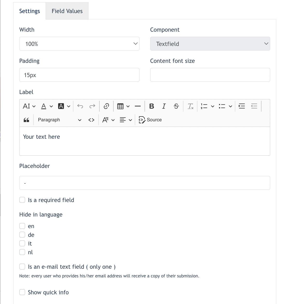
In form:
- Column width - To set the column width of this component.
- Padding - Able to set padding for Top, Bottom, Left, Right of the text field
- Content font size -
- Label - Field's title, for eg.Name : ________________
- Placeholder - this is the text within the text field. An example of placeholder is :

- Is a required field - This is checked when Center Admin like to set this text field as mandatory. After checked, users cannot submit this form if the "is required field" is not filled in.
- Hide in Language - This field will be hidden for a certain language / country.
- Is an email text field - If this checkbox is ticked, the system recognise this text field is for Email address. Any users who provides their email address here, system will send a copy of their submission back to their email address.
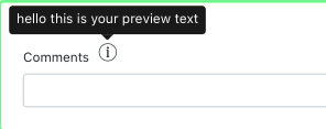
- Show Quick info - If Center Admin like to explain what this text field is about, he can add a "Show Quick info" which looks like below :
1.2. Fields Values Tab
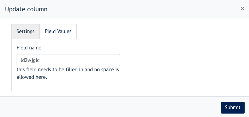
This fields are the field names which will appear in the email content. Example if a 'Name Text field' is created, under the Field's Name, it is normally written as [ Name ]. Thus, when form sender input any data under 'Name Text Field', in the email content, it will look like below :
Name : John Doe
2. Text Area
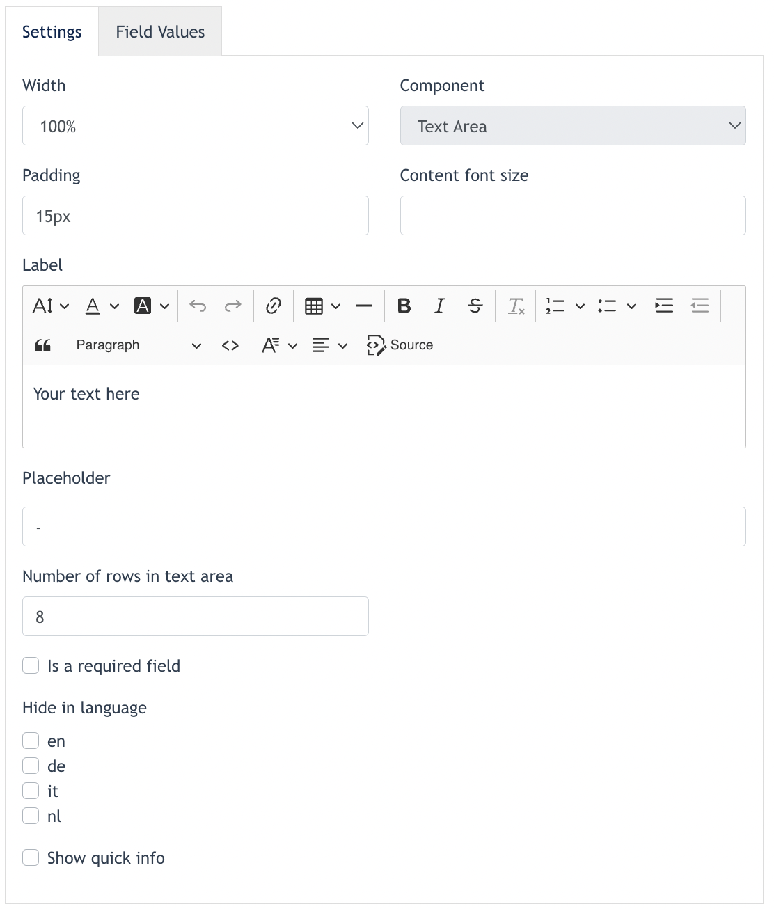
Text Area configuration is the same as a Text Field, the only difference is we can configure how many rows a text area consists of.
3. Radio Button
Here’s an example of a form with radio buttons:
Preferred Mode of Contact:
- (●) Phone
- ( ) Text Message
3.1 Configuration of the Radio Buttons
Go to the [ Settings ] tab :
Fill up the General configuration for this component
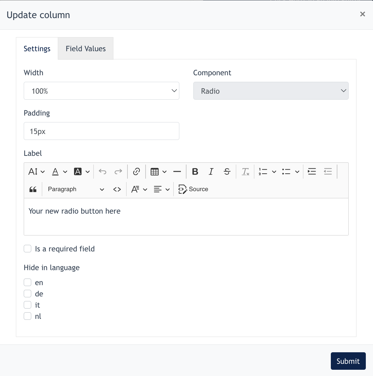
Go to [ Field Values ] tab :
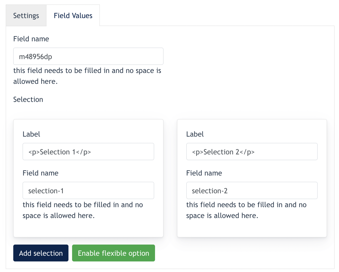
Fill in the "Field Name" for your Radio Buttons set, and fill in names for "Selection 1" and "Selection 2"
If there are more than 1 option in this Radio Button set, Center Admin can click on "Add Selection" to configure up to unlimited radio button.
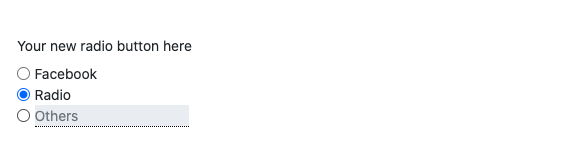
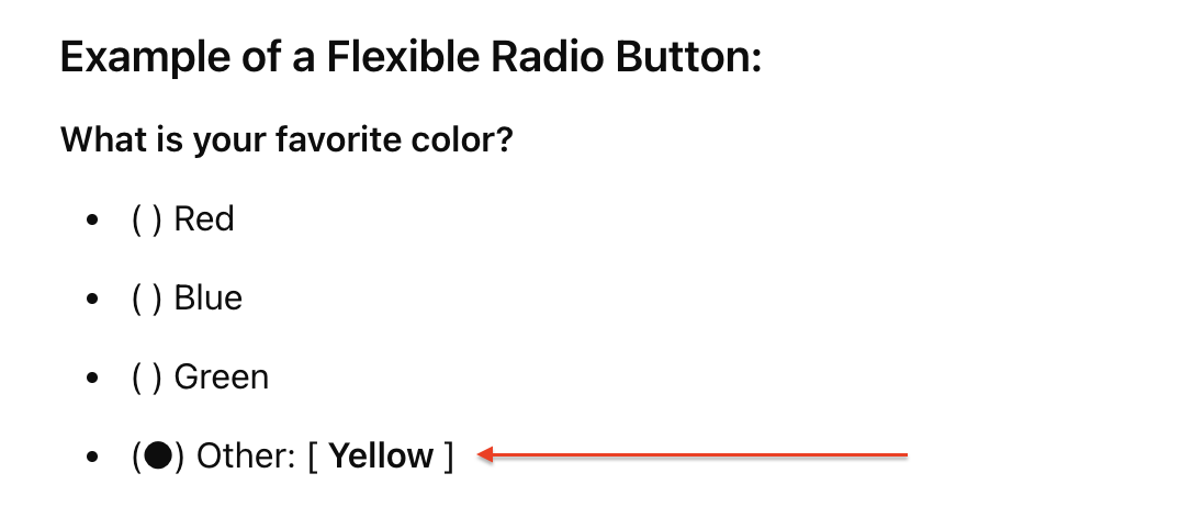
Enable flexible option - this allow Center Admin to add an option which allow text input from website visitor.
Example outcome:
Another example :
4. Text
This component is used to create a chunk of text for the form.
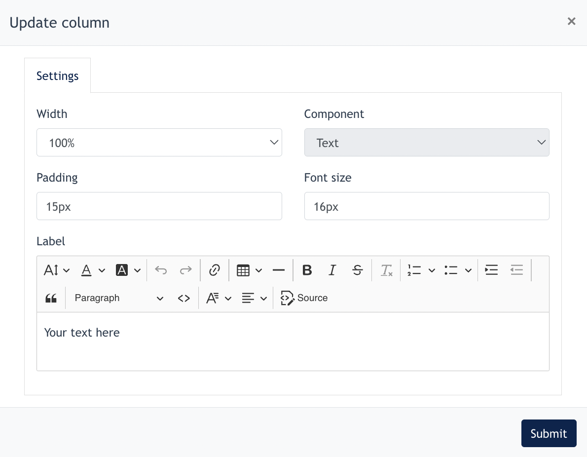
Configuration is simple as above.
5. Checkbox
A checkbox is an interactive UI element that allows users to select one or multiple options from a set of choices. Unlike radio buttons, checkboxes let users make multiple selections simultaneously.
Center Admin first fill in general setting of the checkbox :
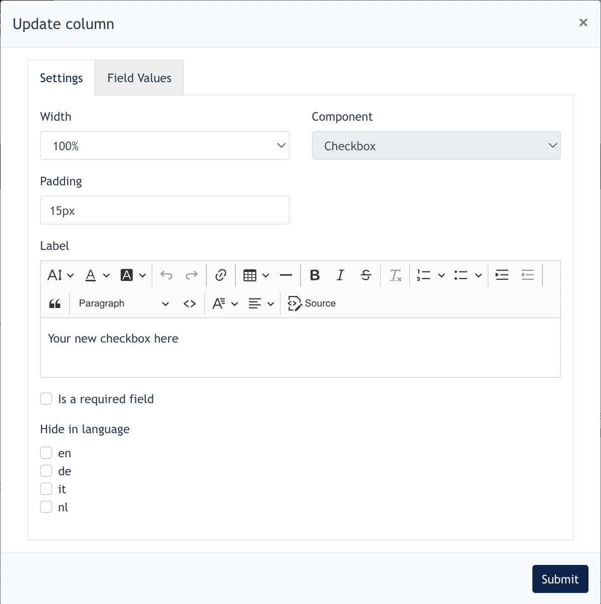
5.1 Field Values Tab
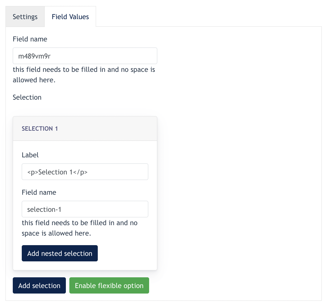
Under this feature, Center Admin can configure the following :
- Create first level selection
- Create Nested Selection
- Enable Flexible Option (explained under 3. Radio Button)
Example outcome like below:
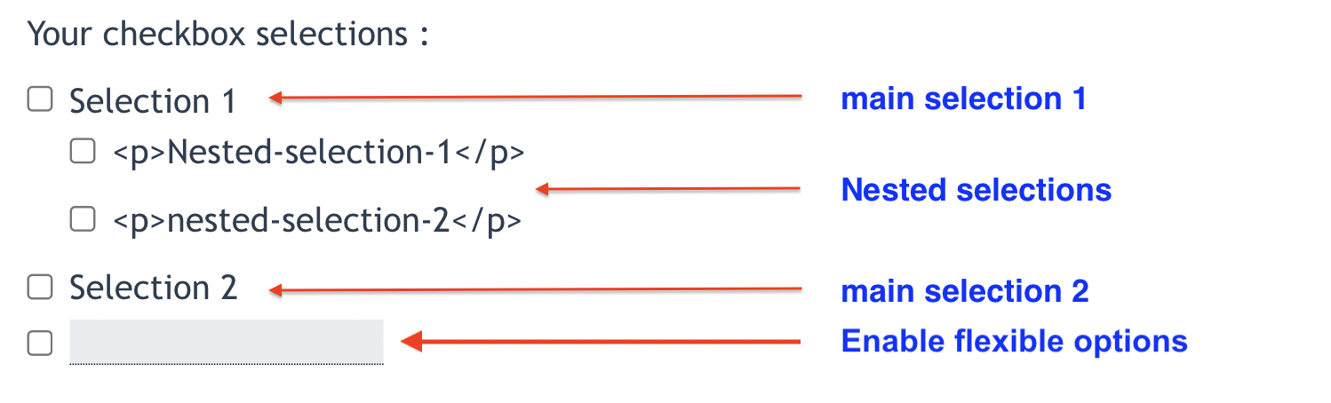
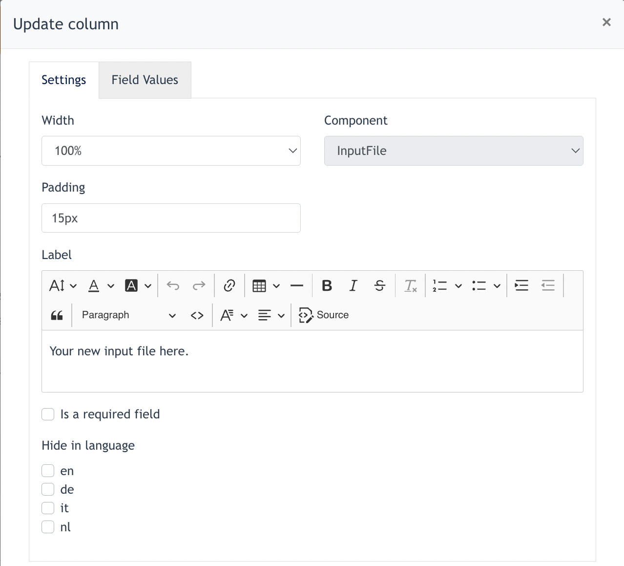
6. Input File
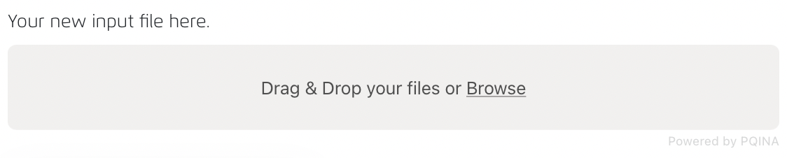
This component allows users to upload files onto the form.
Fill in the general fields for this component and field values. and click submit.
Example outcome as below :
7. Images
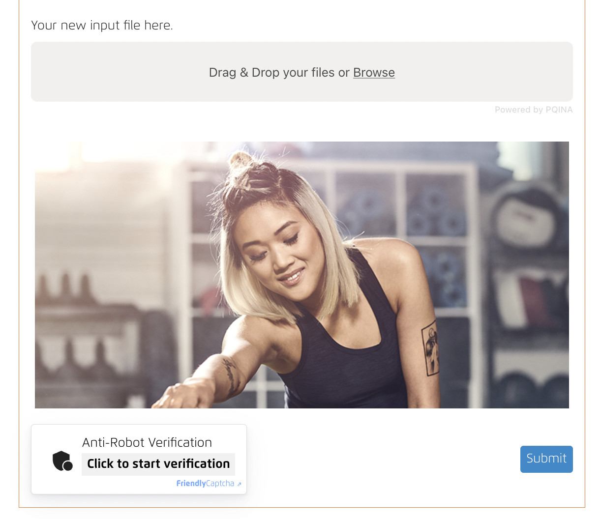
This component allows the User to add images on the form.
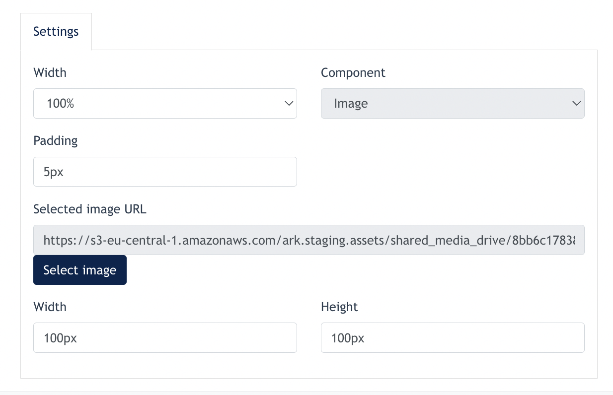
For this component, Center Admin may upload an image, and configure the width & height of the image.
After click submit, the image will appear on the form. Example shown below :
8. Datefield
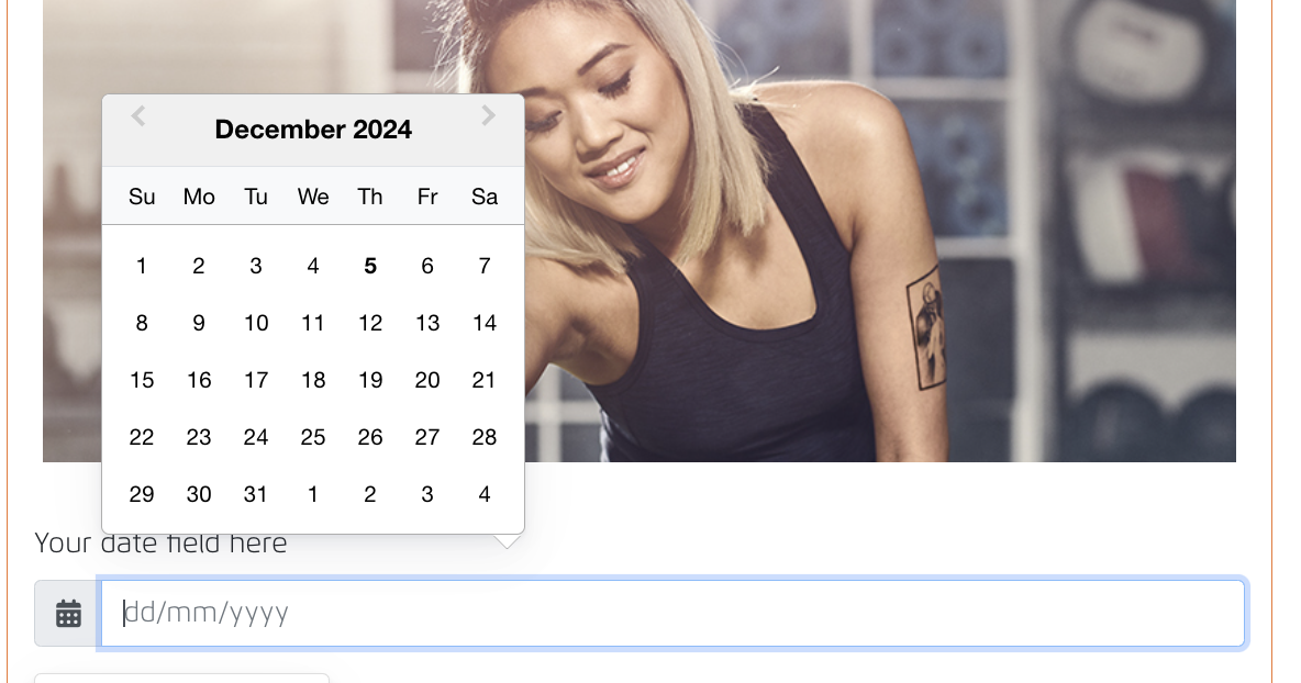
This component allows Center Admin to create a Date picker. Web visitor can select a date via this form.
Configuration - Center Admin fill in the general fields below and field values.
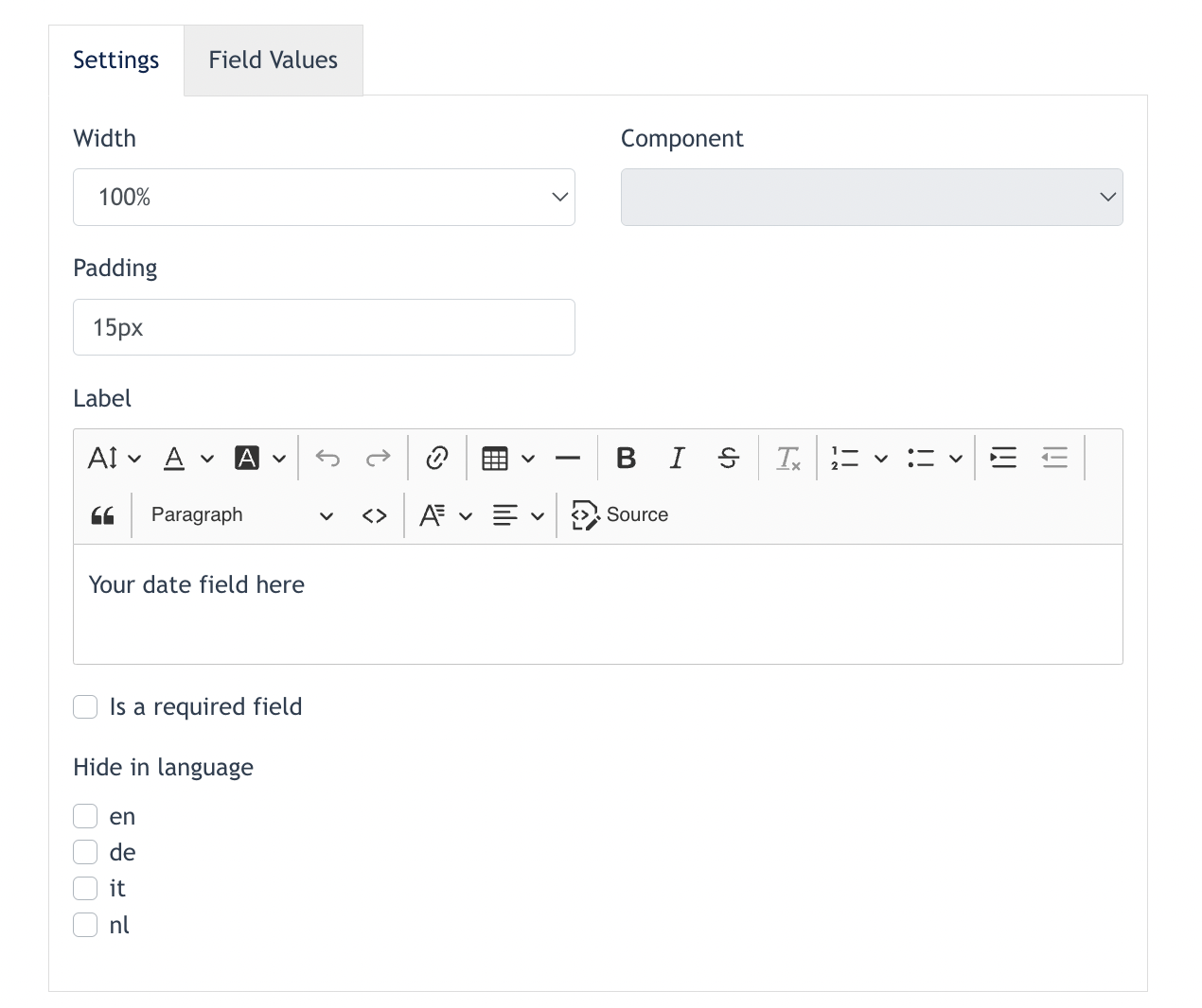
After submit, this will be the outcome on the form :
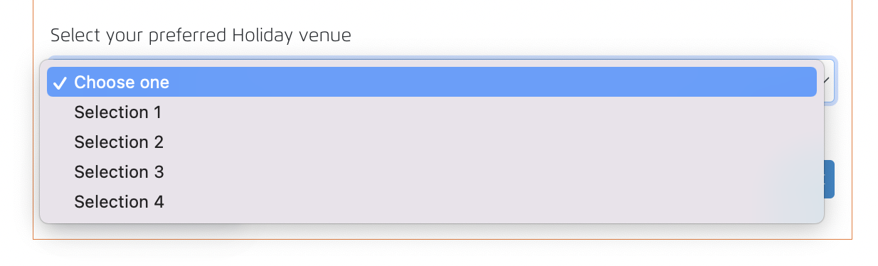
9. Drop down
A dropdown is a user interface element that displays a list of options when clicked or interacted with. It’s commonly used in forms, navigation menus, or applications to allow users to make a selection from a predefined set of choices.
Center Admin may configure a dropdown component using conida site form.
First, fill in all the general fields required :
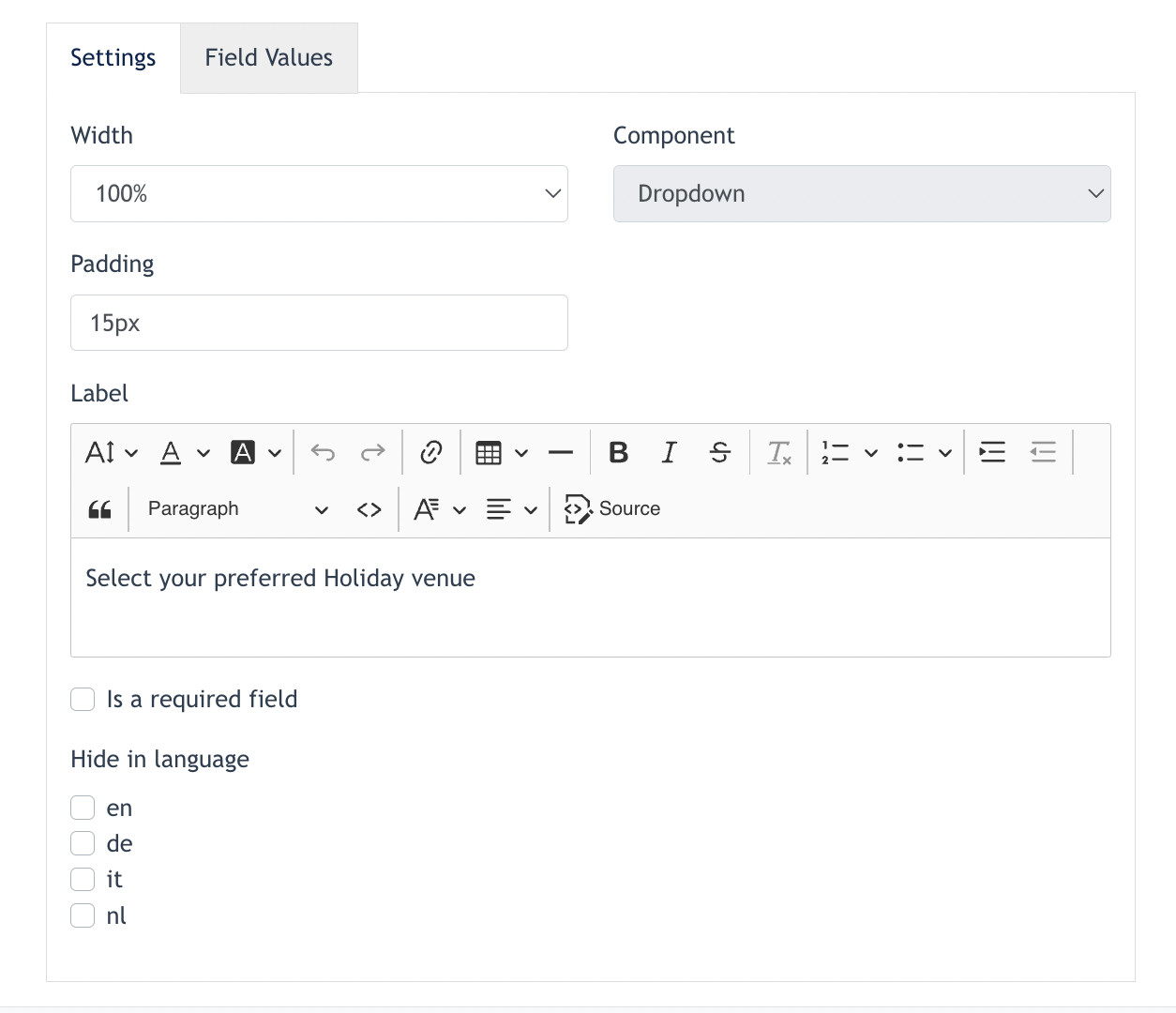
Then, configure the dropdown listing via "Field Values" tab.
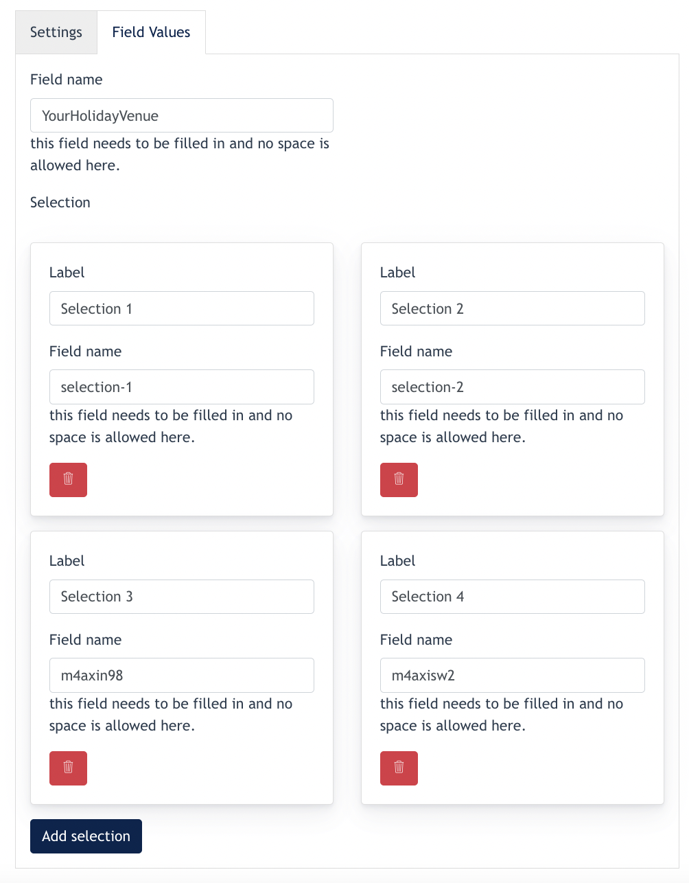
After configuration, you will have the following outcome on the form :
- the end -