Create/Edit Site Content
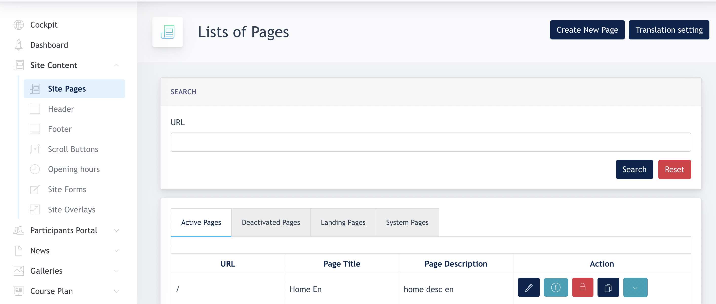
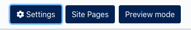
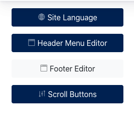
Site Content is our Page Editor modules. Under the Main Menu, we have the following sub-menu for different functions:
- Site pages
- Headers
- Footers
- Scroll Buttons
- Opening hours
- Site form
- Site Overlay
1. Site Pages
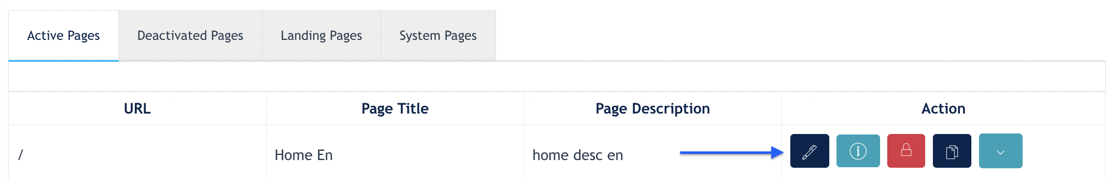
Site Pages consists of listings which displays all pages within the website. Center Admin can create, edit, and delete pages here.
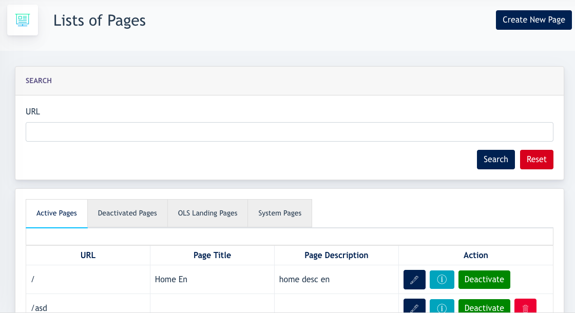
1.1 List of pages
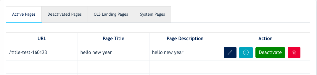
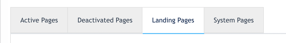
All website pages will be visible on this overview. There are 4 types of pages :
- Active Pages - Pages with Active status and visible on the website
- Deactivated Pages - Pages with InActive status and not visible on the website
- OLS Landing Pages - Pages which are created as single Landing page
- System Pages - Pages belonged to system's mandatory pages and are not deletable by the Center Admin
Staging URL : https://kws.jaramdo.de/admin/site-content/pages
1.2 How to Create New Page
Click on "Create New Page" button:
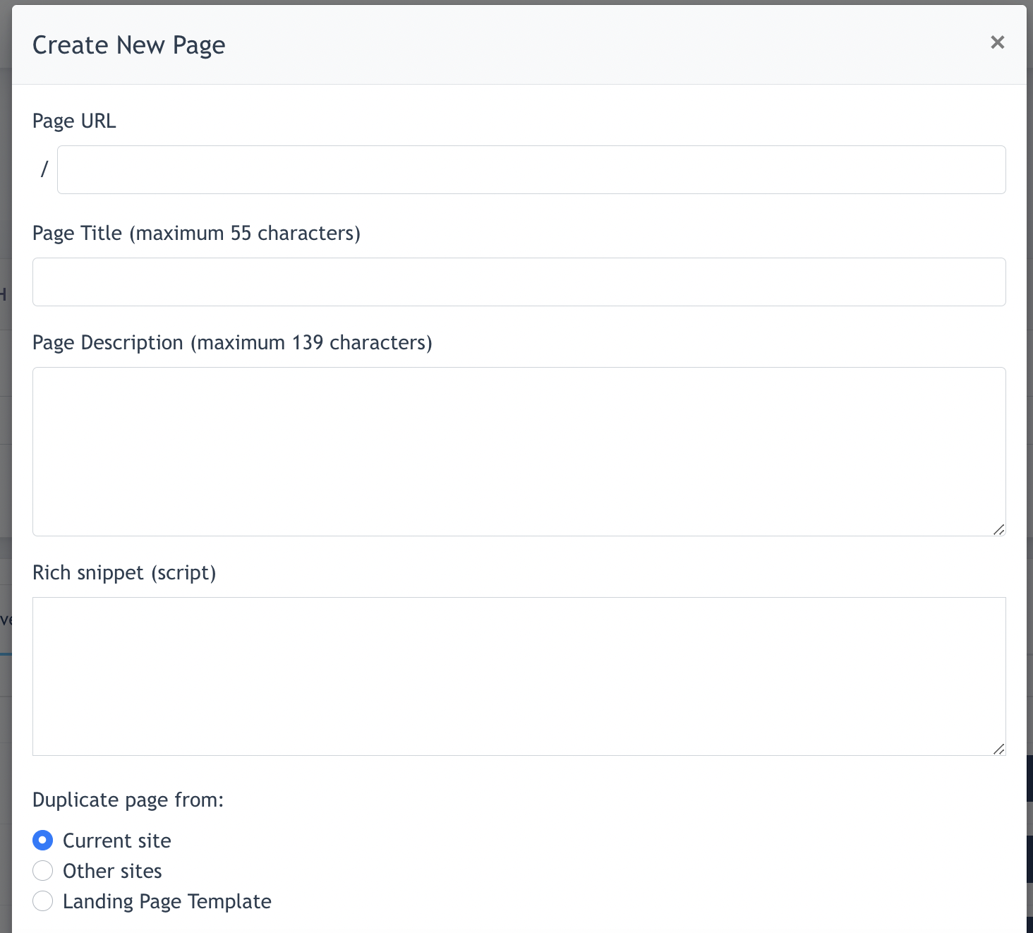
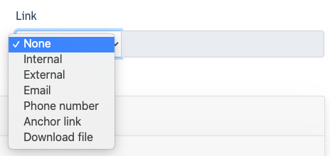
- Fill in your 'Page URL' , 'Page Title' & 'Page Description'
- Fill in Rich Snippet
- Center Admin can choose to duplicate a page from :
- Current site - select existing site page to copy from
- Other sites - This option is only visible to System & Super Admin)
- Landing page template - select an existing page template available
Remarks : All the above fields are mandatory to fill in & select when creating a page.
- There are 2 options to choose from when a new page is created :
- Make this page a landing page : If this option is chosen, this page will be a landing page instead ( standalone ).
- Make this page without header : if this option is chosen, the header ( with all menu items ) are removed.

- When a page is successfully created, it will appear on the {Active Page} tab.
- If you select "Make this page a Landing page" during creation, then the new page created will appear under the OLS Landing page tab.
1.3 Edit a Page
ForAfter editinga an existing page, there are the following options.
Updatenew page:isforcreated,changingtothefurther build and edit content of the page. Click on the "Edit" button on the pageinlisting.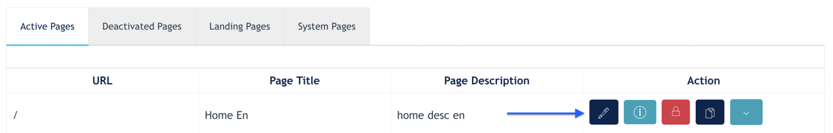
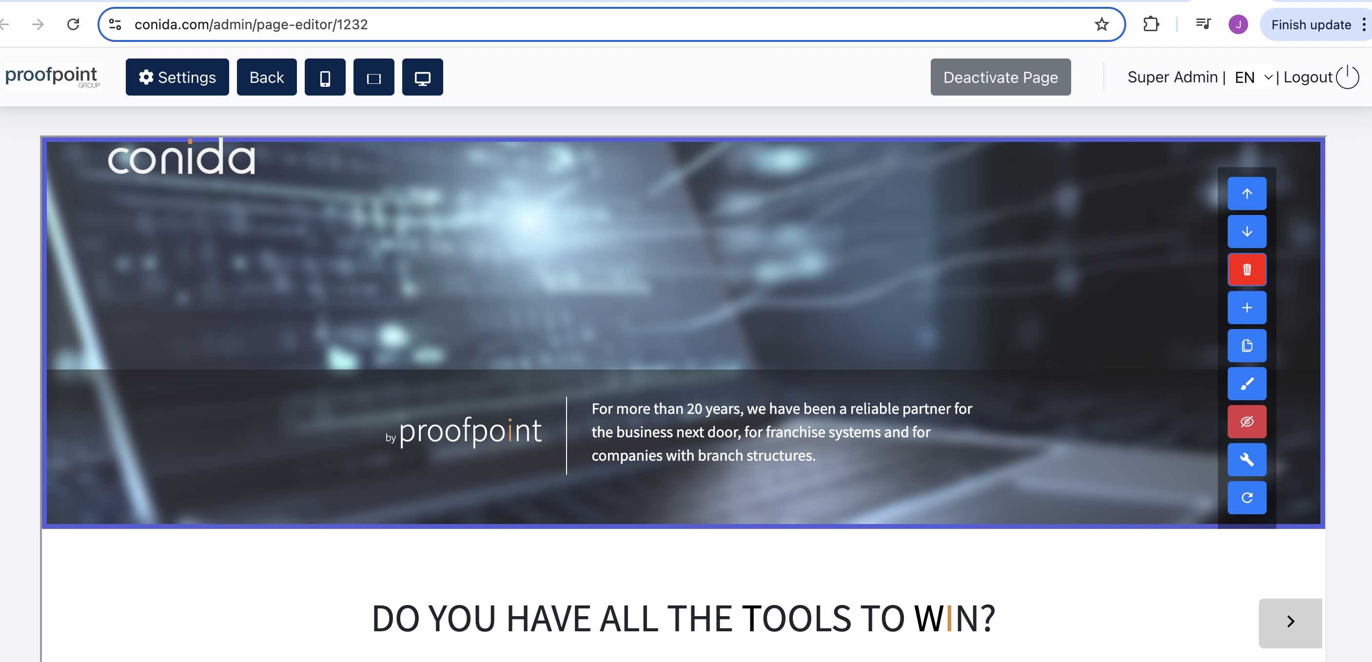
You will enter the page editor
Updateof the website.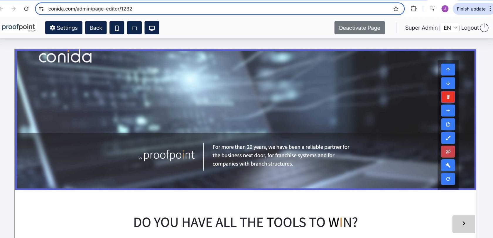
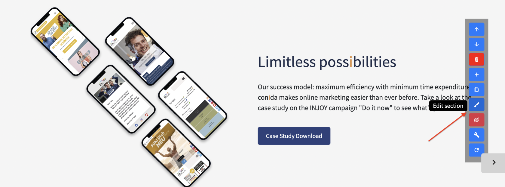
conida page
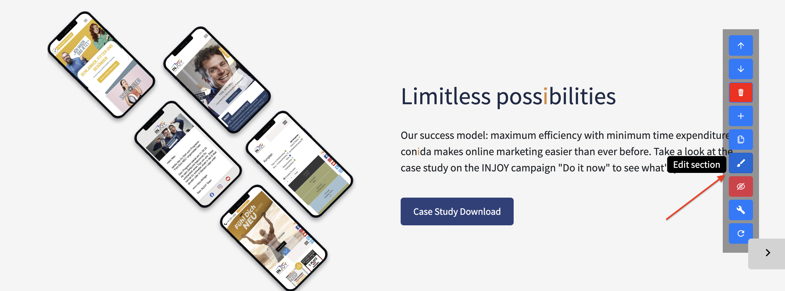
infoeditor:consistsforofchangingmultiple sections which builds up theinformationpageofcontent. Center Admin edit the section individually using the tool that is on the right.Tool bar:
- Up/Down Arrow - Move the section up or down the page
Activate/deactivateRecycle:binactivating- Delete the section- '+' button - Add a new section
- Duplicate button - Duplicate current section
- Pencil button - Edit the current section
- Eye-crossed button - Hide the current section
- Spanner button - Code section ( use and
deactivatingvisible for system/super admin only) - Reset button -
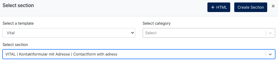
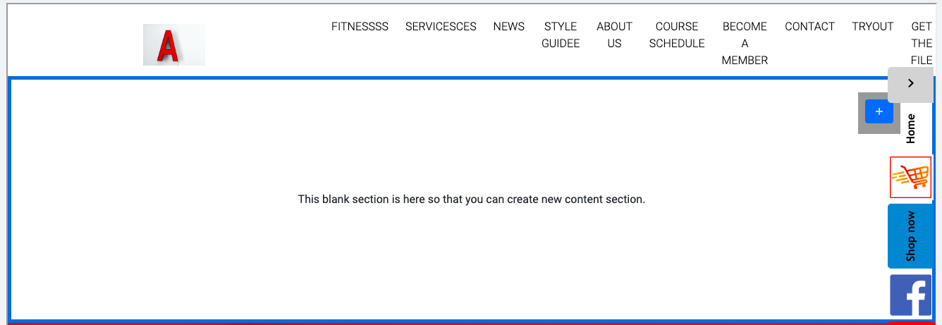
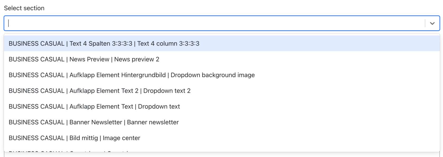
1.4 Add Section
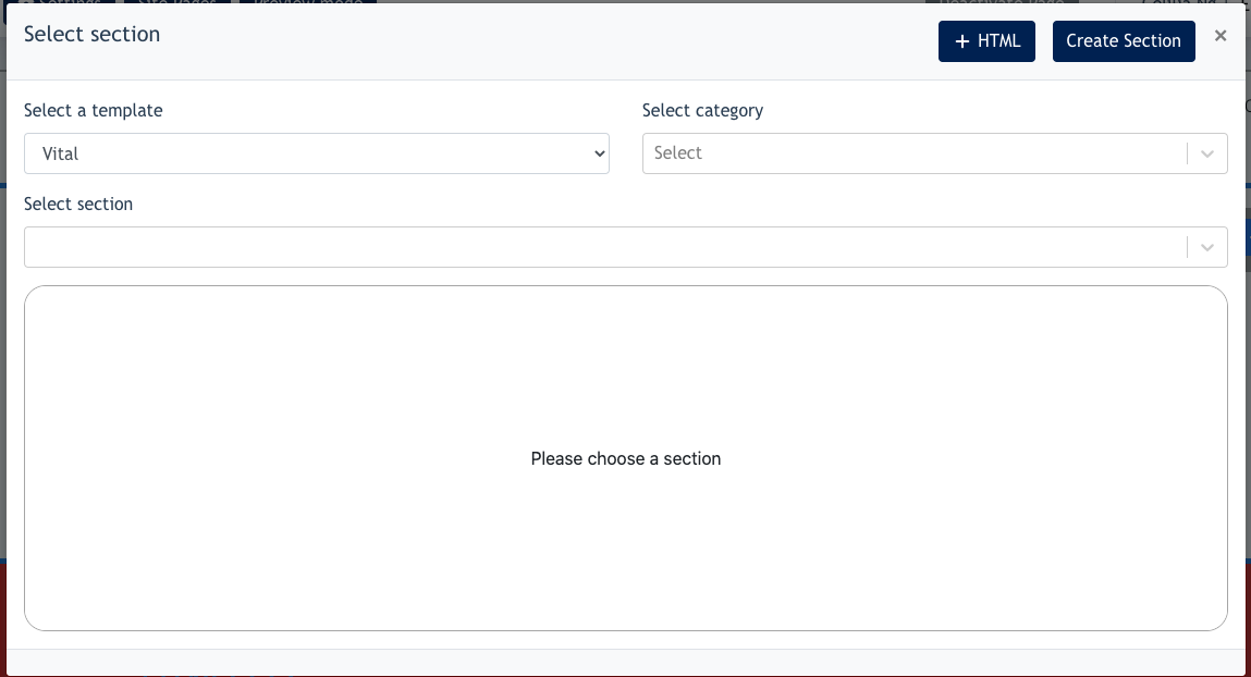
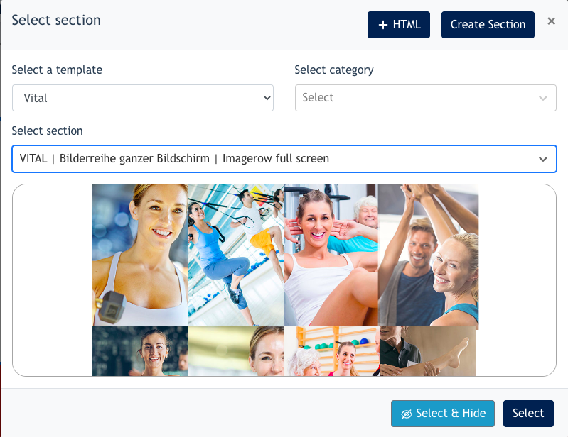
When click on the '+' button, you will come to the following modal :
- Select a template - this show your existing website template theme (For eg: if your website is built using Sale template, Center Admin will see 'Sale' by default
- Remarks : Super/System Admin can see all templates on this listing
- Select category - select category of
asectionspage DeleteSelect:sectiondeletes-theListingpage
of section templates available to be chosen from

1.5 Edit Section
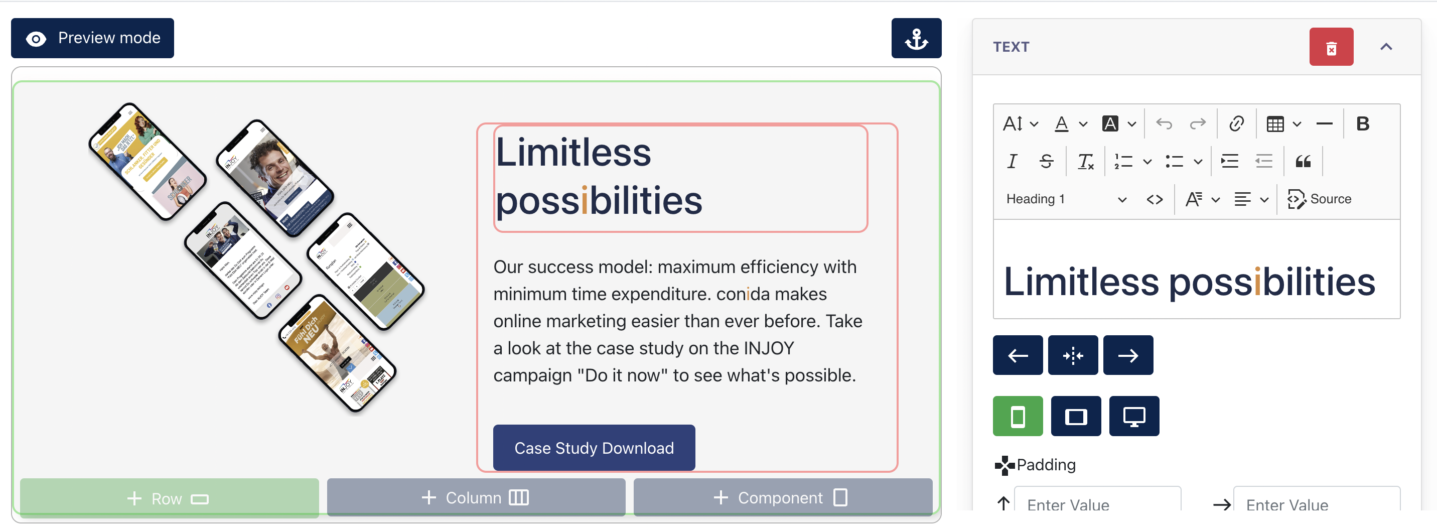
After a section is added, Center Admin can click on the "Edit" button to edit section content.

 Screenshot after clicking "Edit"
In the Edit Section, you may edit text, images, row & column padding margin, container color background.
Center Admin can also make use of the [ + Row ] [ + Column ] and [ + Component ] to add on the section's content.
2. Site Forms
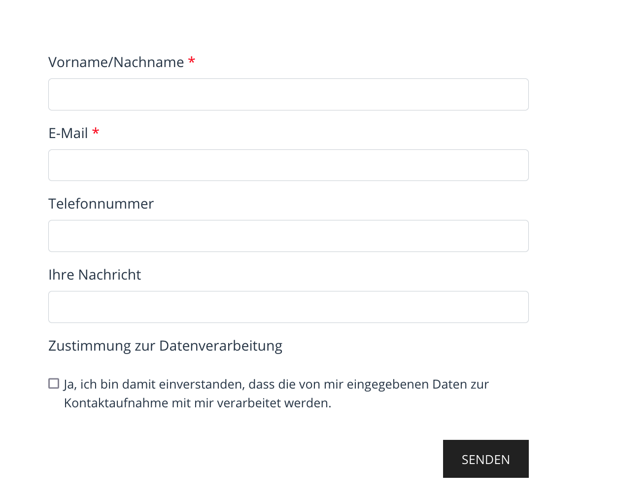
Site Forms are smart sections within the pages. to build forms requesting information from visitors.
Each homepage has a “contact form” by default on top of this,and its own forms can be created as well.

2.1 Site form listing
The listing will display all the forms available on the website. When a visitor submits a form, it will appear under [ view submitted data ]. However, the data only stays for a certain time, with the configuration by theUserunder GDPR > Data configuration.
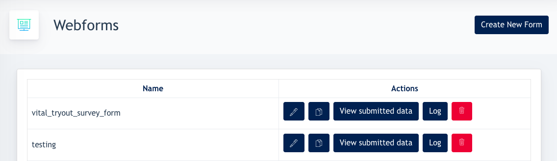

Also the user can edit, duplicate or delete his forms here.
2.2 Creating a form
In this case, we’ll take the Contact form as an example.
Go to Site forms > Create new form
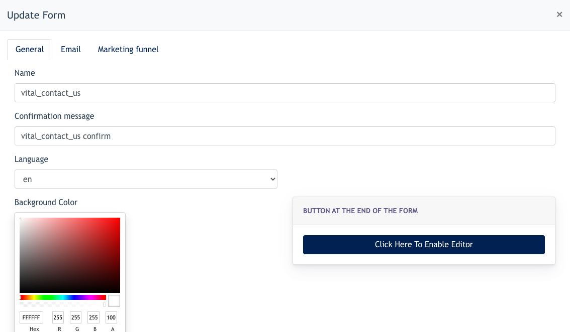

In the form :
- Name - Form’s name
- Confirmation message - the message appears on the Site Panel after a visitor has submitted a form
- Language - which language setting for this form (notification: the language shown is always the one the user has selected while visiting the page.)
- Background colour - form’s background colour, it is white by default.
- Buttons configuration - choose this option if user like to change the looks of the button and its behaviour after clicking the button
- Adding new elements - here the user may build a form using different types of elements
The { Email } tab under Site form, is to configure the following :
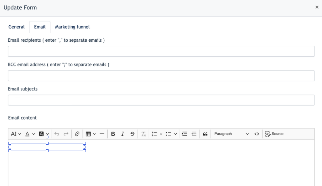

- Email Recipient - configure who will receive an confirmation email when a user submit a form
- BCC Email Address - configure which email is BCC to when a user submit a form
- Email Subjects - Subject of the email
- Email Content - Content for email recipient
- Email Content for Form Sender - Content for site form sender
- Checkbox of [ Note: every user who provides his/her email address will receive a copy of their submission ] - This is automatically checked when a site form consists of an Email field.
Remarks : The Marketing Funnel tab will be explained under the Marketing funnel module documentation.
Steps to create a Form
After the above is configured, you may now create the site from using the elements provided.

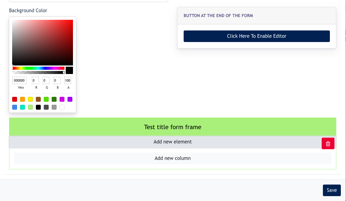
First, add a title by clicking on the top border of the form.
Then, you may start to build your form by adding new elements into the form, and configure them one-by-one.
List of components available on Site form :
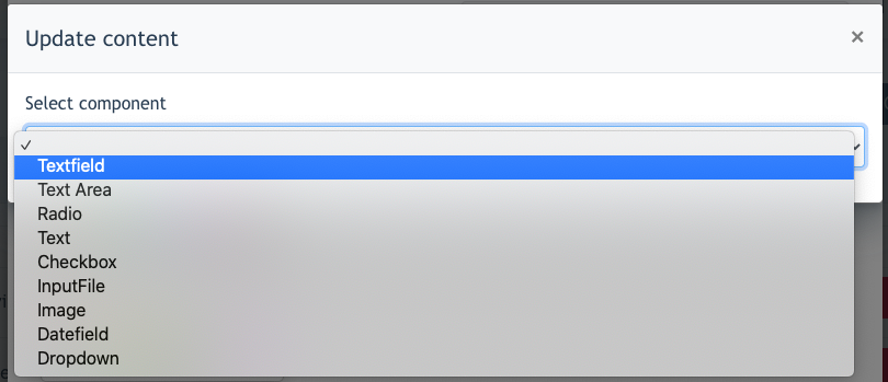

- Textfield
- Text Area
- Radio
- Text
- Checkbox
- Input File
- Image
- Datefield
- Dropdown
1. Textfield
Text field component allows the user to fill in information according to the field title. Most of the time, this can be used to create a Name field, email field, mobile field…etc. Text field consists of only 1 row.

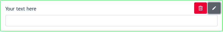
Click on the Edit button for further configuration:
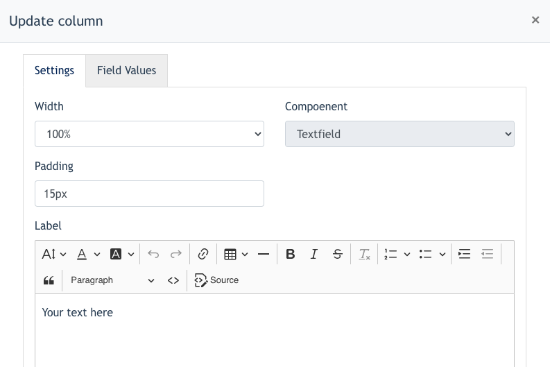

In form:
- Column width - To set the column width of this component.
- Padding - Able to set padding for Top, Bottom, Left, Right of the text field
- Label - To set a label for this field, for eg.Name : ________________
- Checkboxes - The checkboxes have a special function.
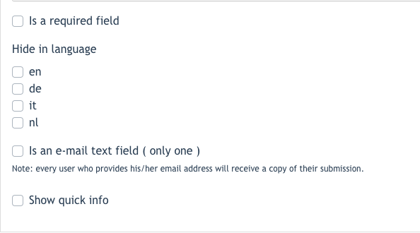

-
- Is a required field
- If ticked this field is mandatory for visitors to fill in.
- Hide in Language
- This field will be hidden for a certain language / country.
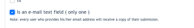
- Is an email text field
- If this checkbox is ticked, this field becomes an email text field. Every user who provides his/her email will receive a copy of their submission.
- When this checkbox is ticked, the email field becomes mandatory and the system will also validate if this is a valid emails by checking on ‘ @ ‘ and ‘ .aa ‘
- Is a required field

-
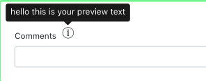
- Show Quick info
- Extra information can be given to the user with an info icon.(example screenshot as below)
- Show Quick info

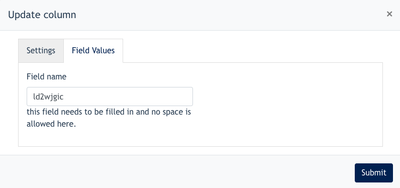

Field Values - This is an important field to set up. Example, if the User wants to set up a [Name] text field, we should input this field as [Name]. So that when a user receives the form submission, they will see something like below :
- Name : John Doe
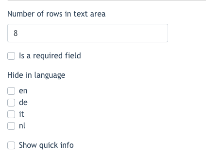
2. Text Area
Text Area configuration is the same as a Text Field, the only difference is we can configure how many rows a text area consists of.

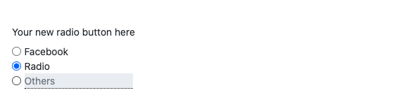
3. Radio Button
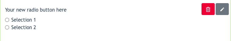

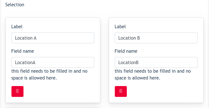
As you can see, by default there are 2 tiles - {selection 1} and {selection 2}. These are the default radio buttons once you select this component. Now is the time to configure them:

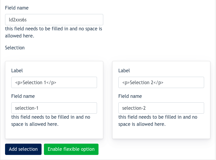
- Label : here, you can configure the selection title.
- Field name : The field name will be shown in all emails and form submissions to explain the data the user filled in
- Add Selection: Click on this tab when you want to add more radio button selections.
- Enable Flexible Option: When this is clicked, it allows you to create a radio button selection which allows users to input remarks/feedbacks.
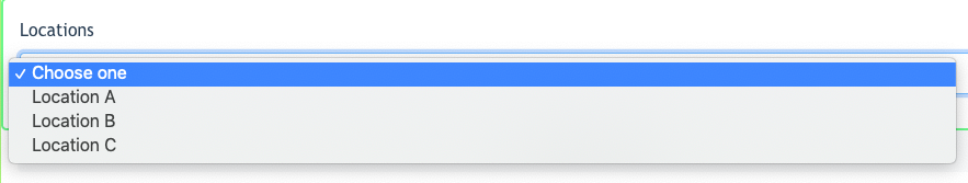
Example outcome:

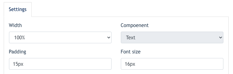
4. Text


This component will be used when User needs to create a chunk of text for the form.
Configuration allowed for this component :
- Column width
- Padding
- Font Size

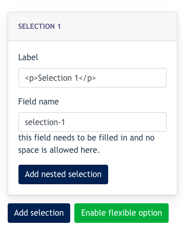
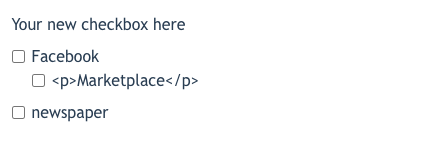
5. Checkbox


Checkbox component allows users to create multiple checkboxes for multiple or none selections.
Under this feature, we can do the following:
- Create Nested Selection & enable Flexible Option (explained under 3. Radio Button)
- {Nested Selection} allows configuration of multiple levels of checkboxes.

Example outcome like below:

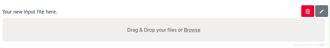
6. Input File
This component allows users to upload files
Example outcome as below :

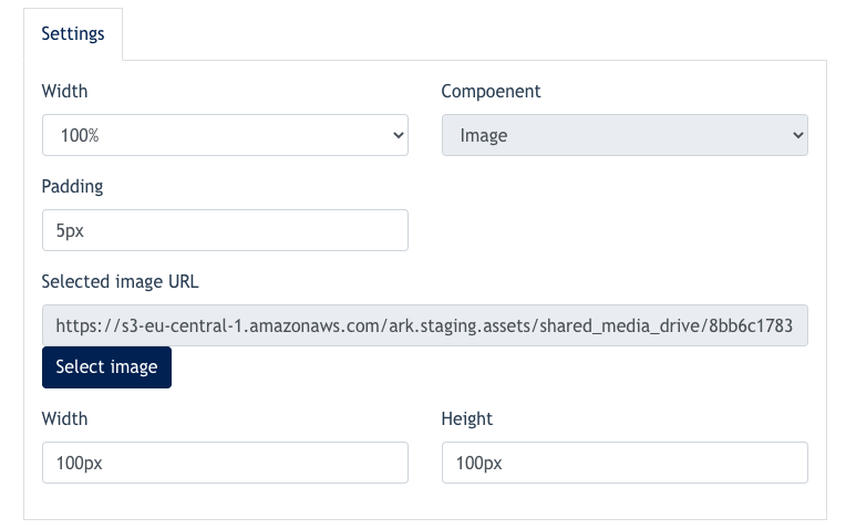
7. Images
This component allows the User to add images on the form.
This is what you can do with this component :
- upload an image- set height/width of image
- set padding

8. Datefield
This component allows the User to create a datefield, and let users pick a date.
Example as below:


9. Drop down
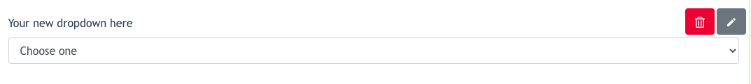

The user may configure the listing of drop down by clicking the edit button:

After configuration, the outcome is like below:

10. Button Configuration
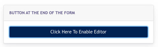
After we’ve built the forms, we may configure further on the [ Submit ] button of the site form.
Click on below button:

The following modal pops up :
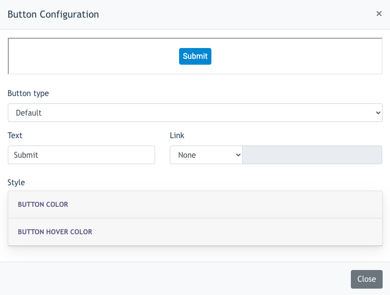

Overhere, you may configure the following :

- Style : Set the colour & hover colour of the button
3. Site Overlay
3.1 Steps to Create Site Overlay
Overlay is a pop up modal created for specific pages of their website visible for a certain time.

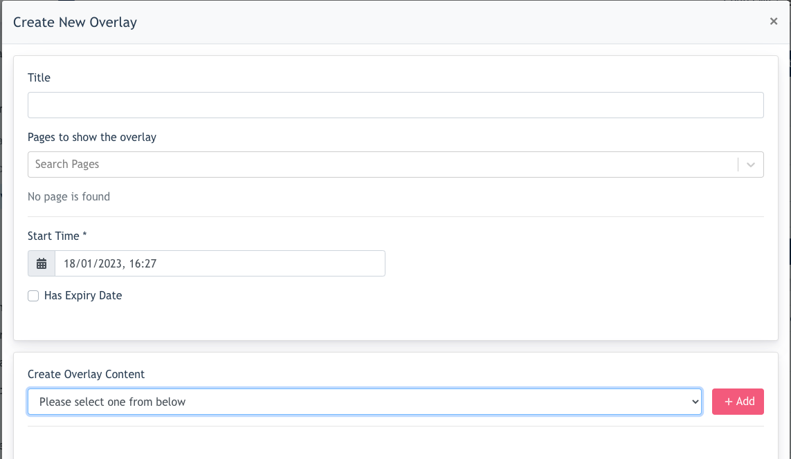
In the form :
- Title - title of the overlay
- Page - may select multiple pages for the overlay
- Start time - select publish time for the overlay automatically
- Has expiry date - select date & time for the overlay to be taken down automatically
- Create overlay content - over here, you may create 3 types of elements here [ image, text, button ]
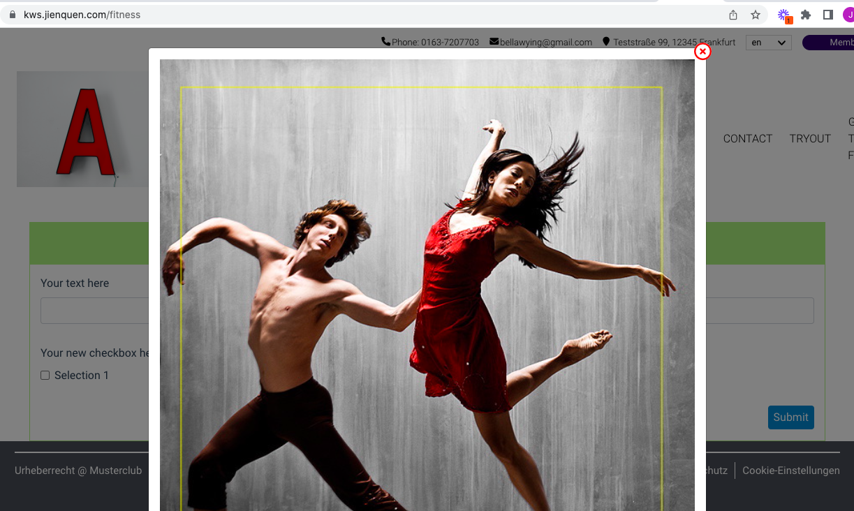
After creation, the overlay will appear on the Listing. When a visitor landed on a page with a valid overlay, they will see a pop up modal like below:

Remarks


4. Opening Hour
Opening hour appear at 2 locations in the site.
4.1 How to set opening hour for site
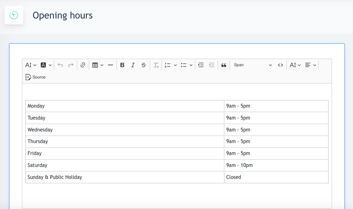
Go to Site Content > Opening Hours , and you will see a blank canvas. You may create the opening hours in this canvas using the tool given.
Create a table, and fill in the information of your opening hour.

The page editor will appear, click on the [ Setting ] button on the top left of page editor.


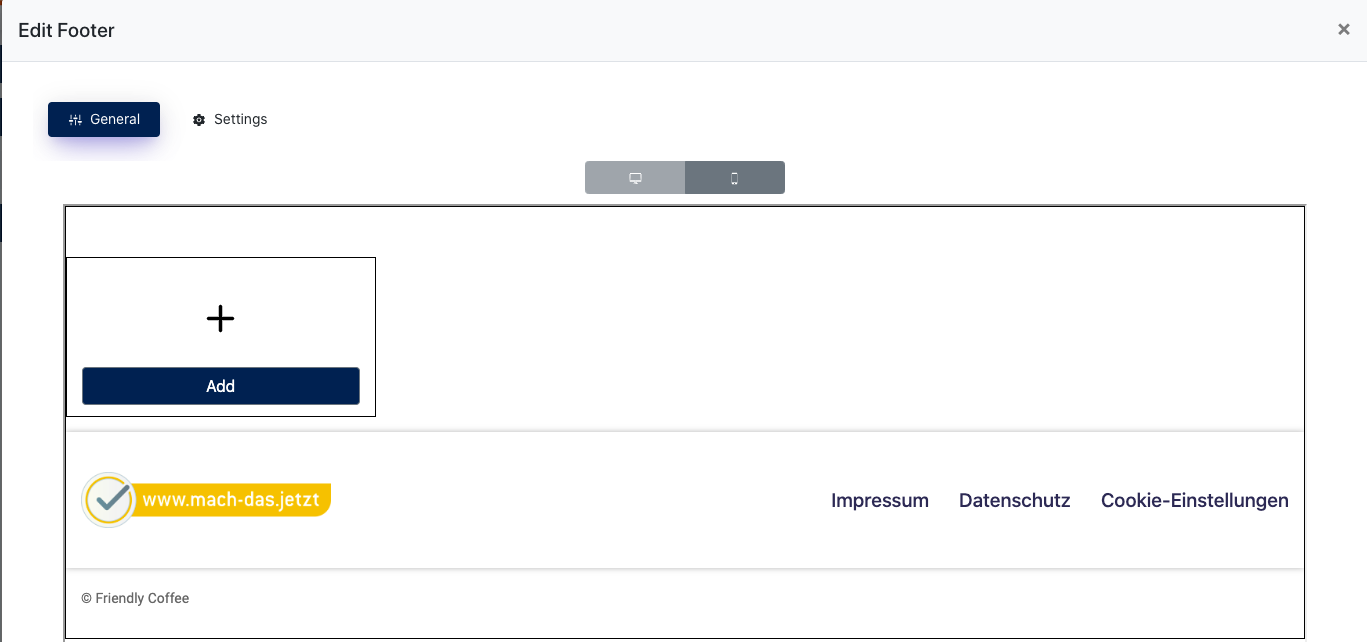

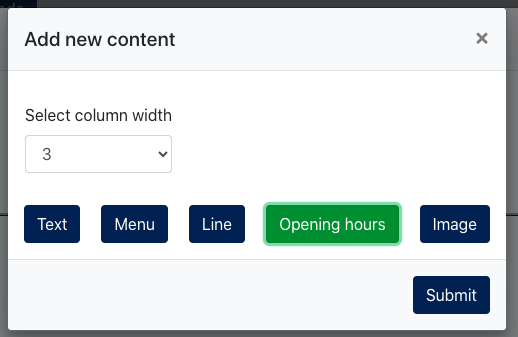
- Click [ Add ]
- Select [ Opening Hour ] and adjust your preferred column width

- Click [ Submit ] and you will see the Opening hour displayed on the footer
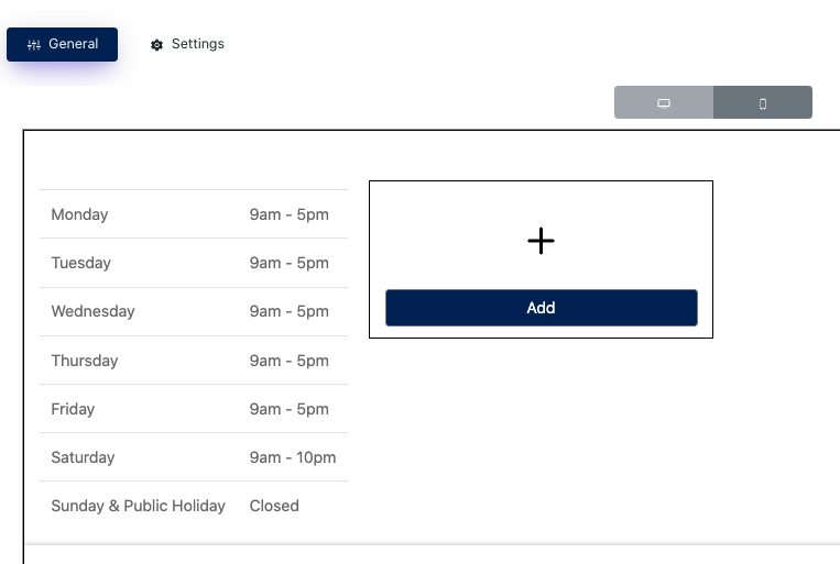

- Be sure to click [ update ] button to save the Opening hour on the footer.
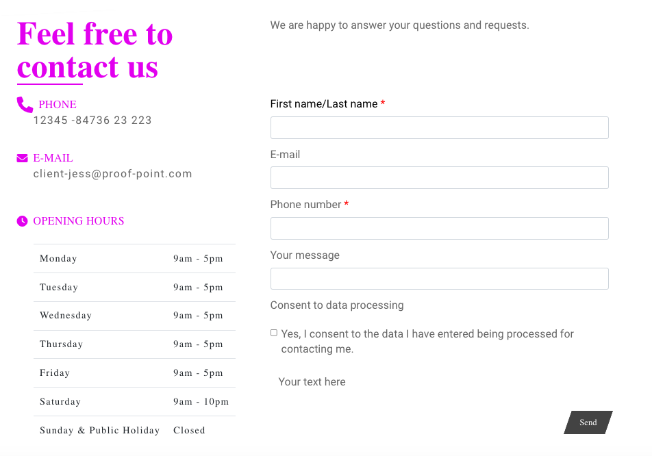
Contact Form with Address
After you created the opening hour, then you will find it on the section template { Contact form with Address } as well.