Create/Edit Site Content
Create and Manage Site Content
The Site Content module is the main content management area of ARK Site. It allows Center Administrators to create, manage, and customize various elements of the website.
The following sub-modules are available under Site Content:
-
Site Pages
-
Headers
-
Footers
-
Scroll Buttons
-
Opening Hours
-
Site Forms
-
Site Overlay
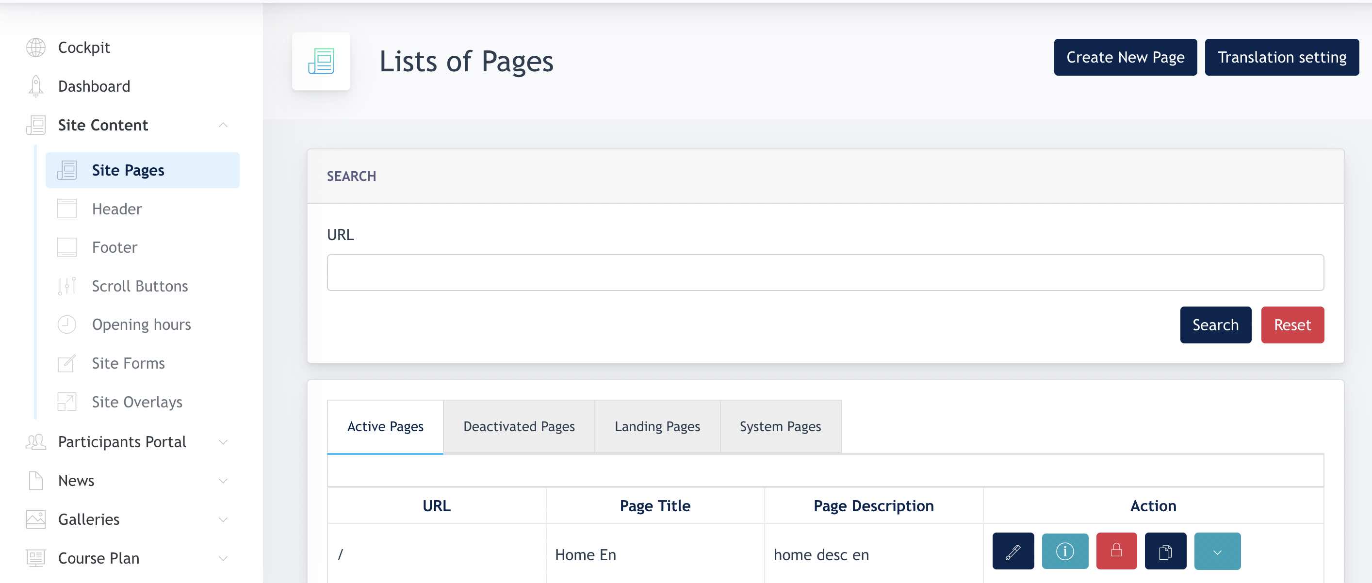
1. Site Pages
The Site Pages section displays all pages available within the website. Center Administrators can create, edit, activate, deactivate, and delete pages from this area.
1.1 Page Overview
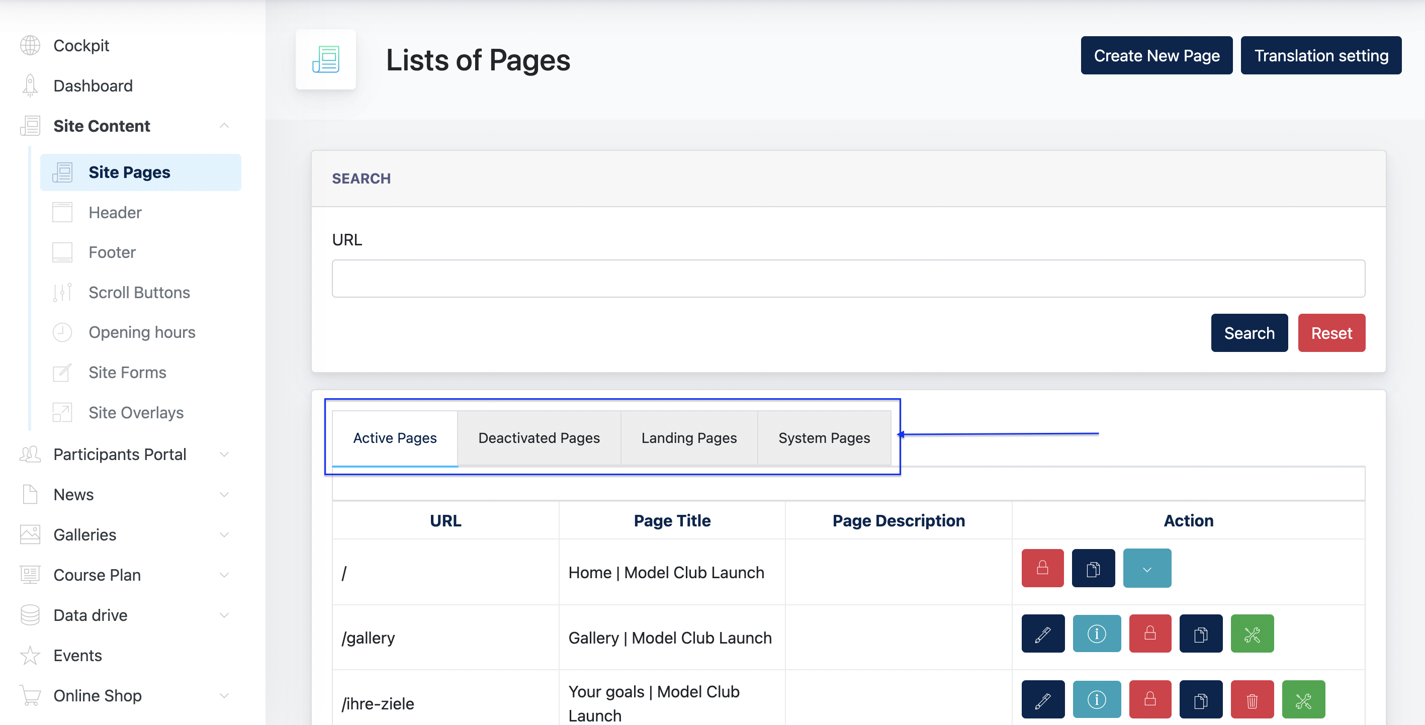
All website pages are displayed in the page listing. Pages are grouped into the following categories:
Active Pages
Pages with Active status that are visible on the website.
Deactivated Pages
Pages with Inactive status that are not visible on the website.
OLS Landing Pages
Standalone landing pages created specifically for Online Lead Services (OLS) campaigns.
System Pages
System-generated pages required for website functionality. These pages cannot be deleted by Center Administrators.
Site Content module screenshot :
1.2 Create New Page
Click Create New Page to create a new website page.
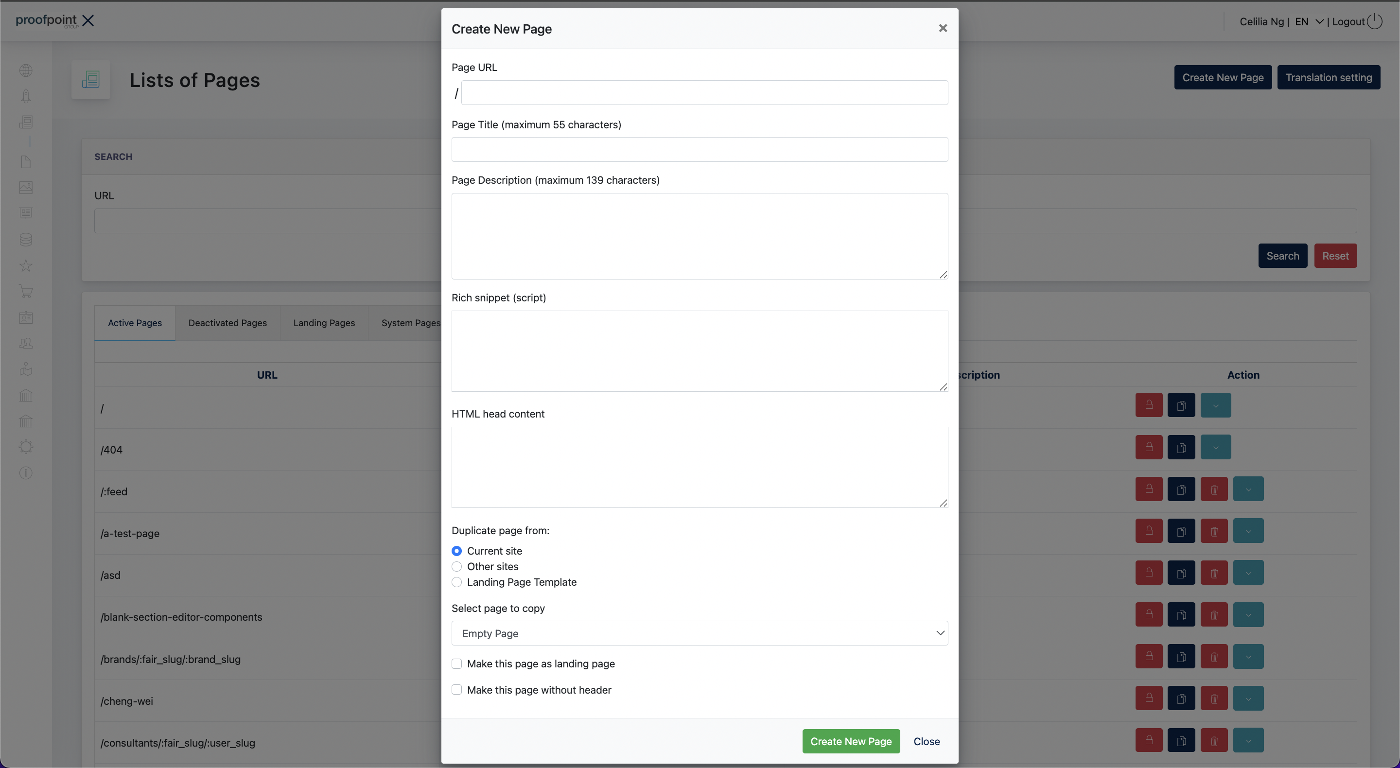
Fill in the following page information:
- Page URL – The URL path of the page.
- Page Title – The page title displayed in search engines and browser tabs.
- Page Description – A brief description of the page content.
- Rich Snippet – Structured data used by search engines, if applicable.
- HTML Head Content – Additional content to be inserted into the page's HTML head section.
Duplicating an Existing Page
When creating a page, administrators may choose to duplicate content from an existing source:
- Current Site – Copy content from an existing page within the current website.
- Other Sites – Copy content from another website. This option is only available to System Administrators and Super Administrators.
- Landing Page Template – Create the page using an available landing page template.
Page Options
The following options are available during page creation:
- Make this page a Landing Page
Creates the page as a standalone landing page. Landing pages are listed under the OLS Landing Pages tab. - Make this page without Header
Removes the website header, including the navigation menu and contact bar, from the page.
Important Information
All required fields must be completed before a page can be created.
When a page is successfully created:
- Standard pages are displayed under the Active Pages tab.
- Pages created as landing pages are displayed under the OLS Landing Pages tab.
Explanation on Head Content:
The HTML Head Content field allows additional HTML code to be inserted into the
<head>section of the webpage.
This section is not visible to users but is essential for SEO and search engine optimization settings, such as language targeting, metadata, or verification tags.In our setup, this field is mainly used to define hreflang tags, which tell Google and other search engines which version of a page should be shown to users in different language regions (for example, Austria and Germany).
Example :
<link rel="alternate" hreflang="de-at" href="https://www.examplesite.at/">
<link rel="alternate" hreflang="de-de" href="https://www.examplesite.de/">This example specifies:
de-at→ German version for Austria (.atdomain)
de-de→ German version for Germany (.dedomain)These tags help ensure that users in each region are directed to the correct localized version of the website, improving both user experience and search visibility.
In summary: The HTML Head Content field is where we add technical SEO elements — such as
hreflangtags — to make sure Google knows which regional website version to display to each audience.
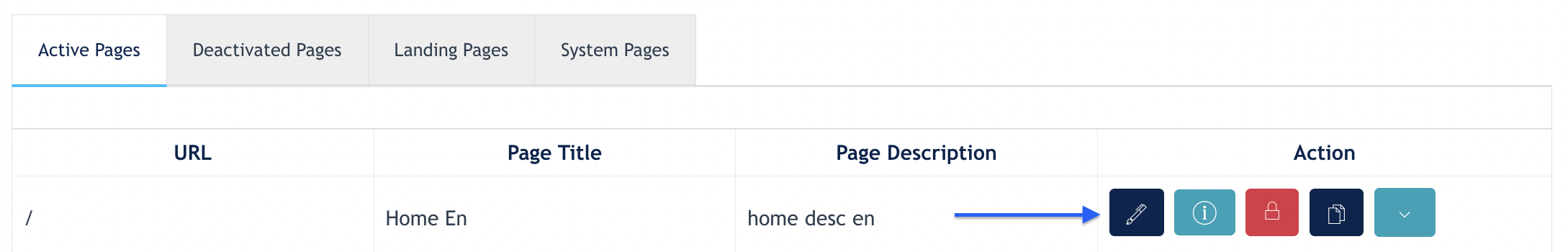
1.3 Edit a Page
After a page has been created, click the Edit button from the page listing to open the Page Editor.
The Conida Page Editor is made up of multiple content sections that together form the page. Each section can be managed individually using the toolbar displayed on the right side of the section.
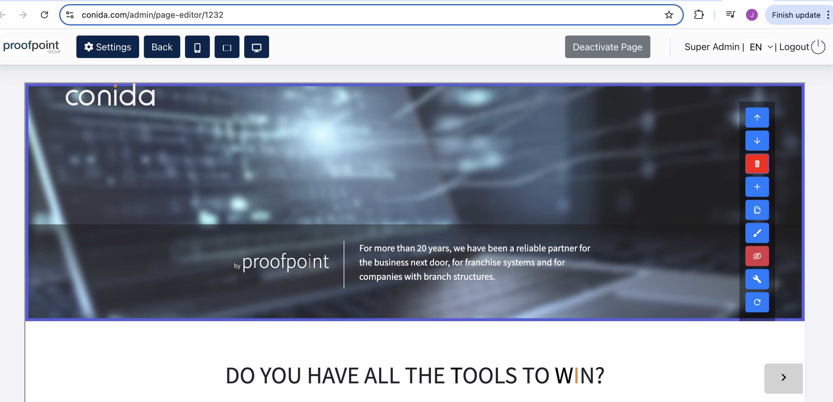
Section Toolbar
The following actions are available for each section:
- Up / Down Arrow – Move the section up or down within the page.
- Delete – Remove the section from the page.
- Add (+) – Insert a new section.
- Duplicate – Create a copy of the current section.
- Edit (Pencil) – Edit the content and settings of the current section.
- Hide (Eye-Crossed) – Hide the section from the website without deleting it.
- Code (Spanner) – Access the section's code settings. This option is only available to System Administrators and Super Administrators.
- Reset – Reset the section to its default configuration.
1.4 Add a Section
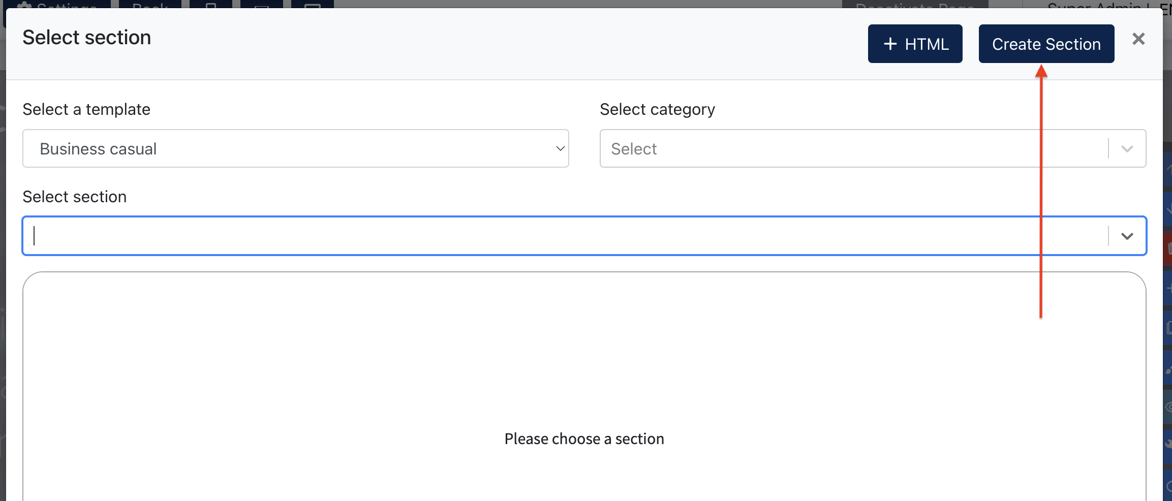
Click the Add (+) button to open the Add Section dialog.
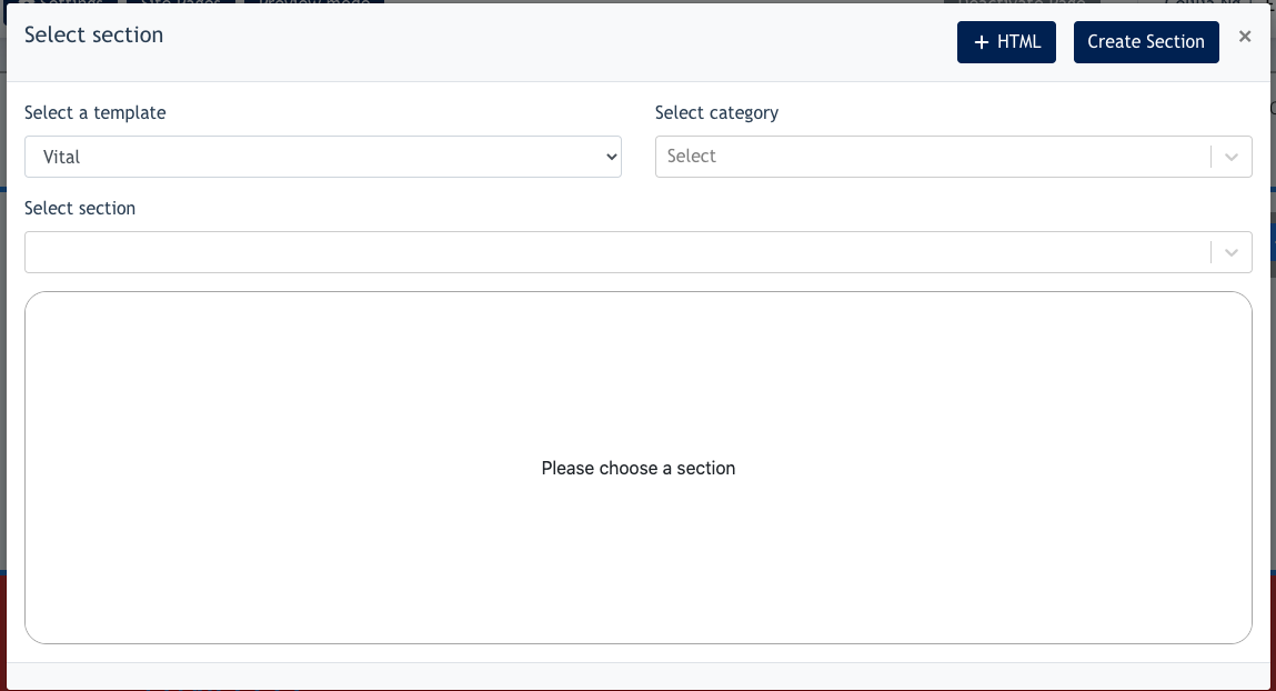
The following options are available:
- Select a Template
Displays the website template currently used by the website.
For example, if the website was created using the Sale template, the Sale template will be selected by default.
Remark: Only System Administrators and Super Administrators can view and select all available templates.
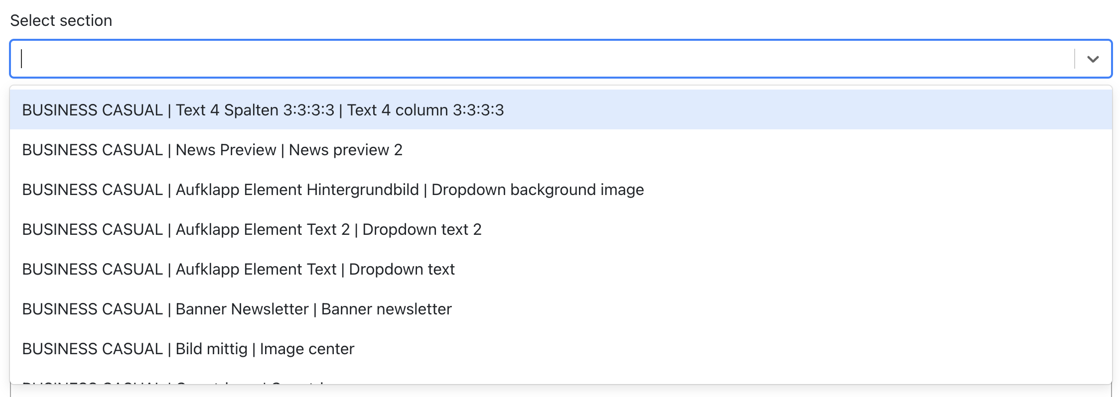
- Select a Category
Choose the category of sections to be displayed. - Select a Section
Displays the available section templates within the selected category. Select a section to add it to the page.
Screenshot of Select a Section listing :
1.5 Edit a Section
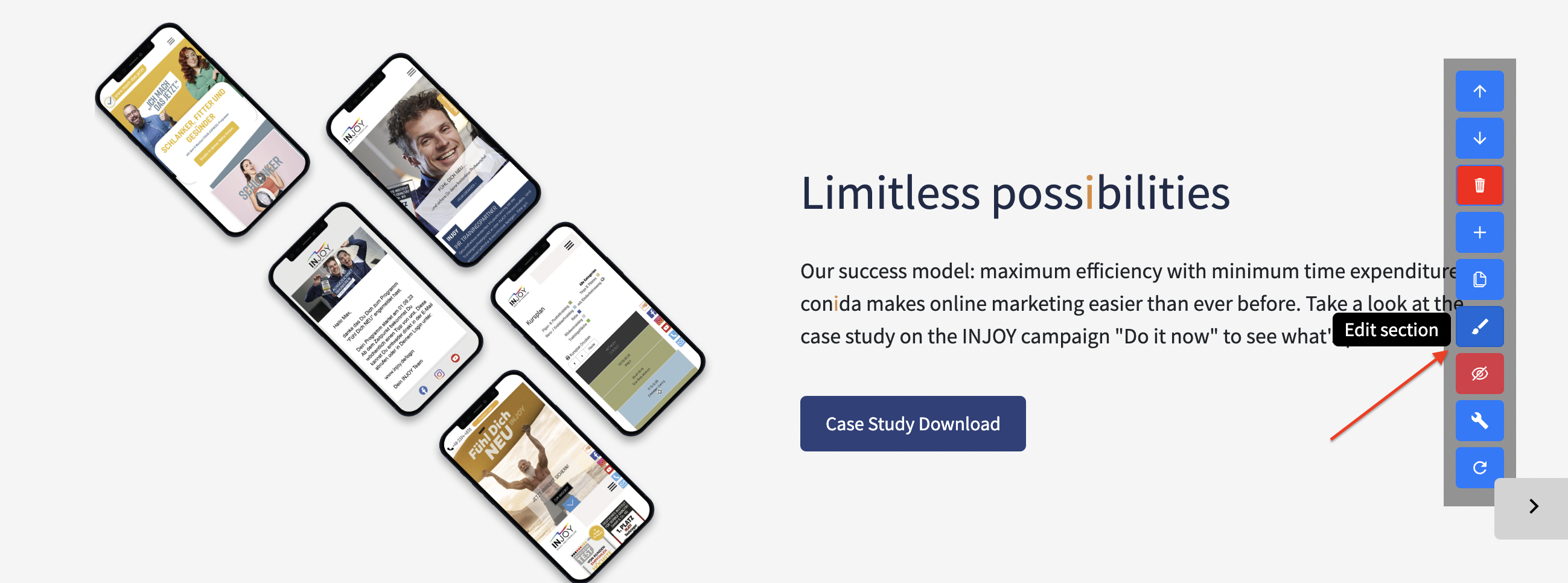
After a section has been added to the page, click the Edit button to modify the section content and settings.
Section Editor
Within the Section Editor, Center Administrators can configure various section properties, including: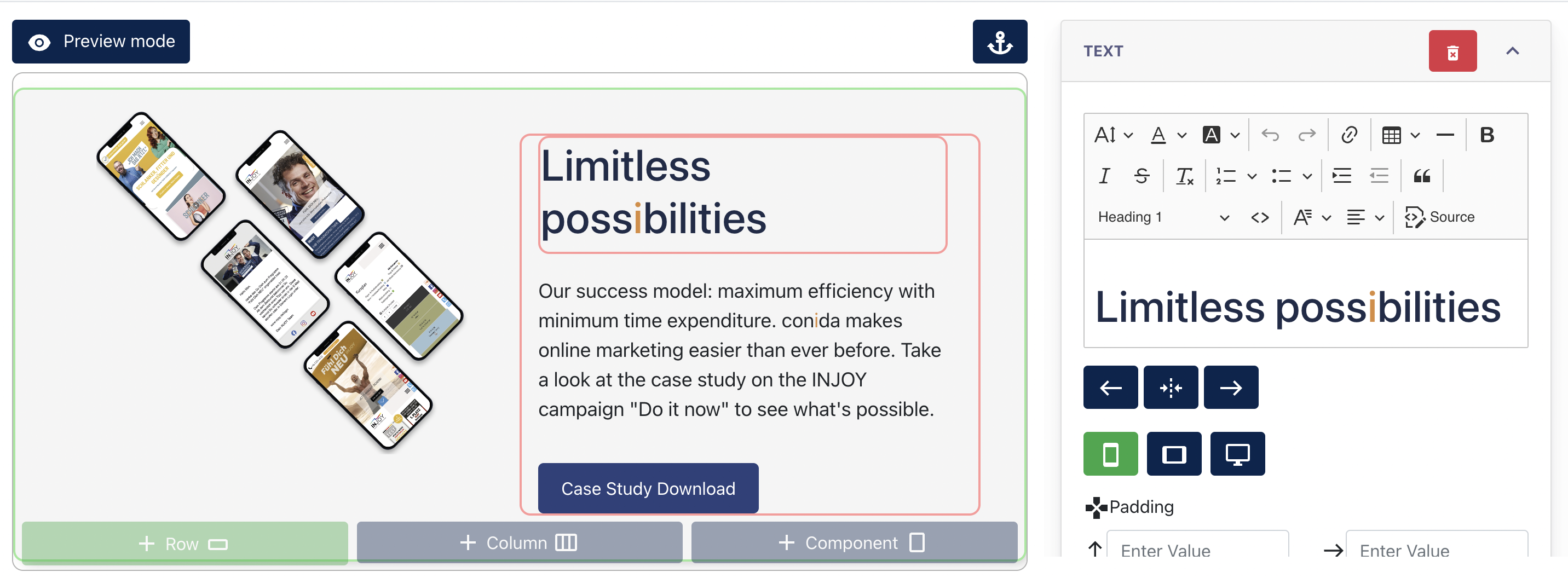
- Text and image content
- Row and column spacing (padding and margin)
- Background colours
- Layout settings
- Component-specific settings
The available editing tools may vary depending on the selected section template and components used.
Additional content can be added to the section using the following options:
- + Row – Add a new row to the section.
- + Column – Add a new column within a row.
- + Component – Add content components such as text, images, buttons, and other available elements.
2. Introducing the Blank Section Editor
The Blank Section Editor allows Center Administrators to build a section from an empty canvas instead of using a predefined section template.
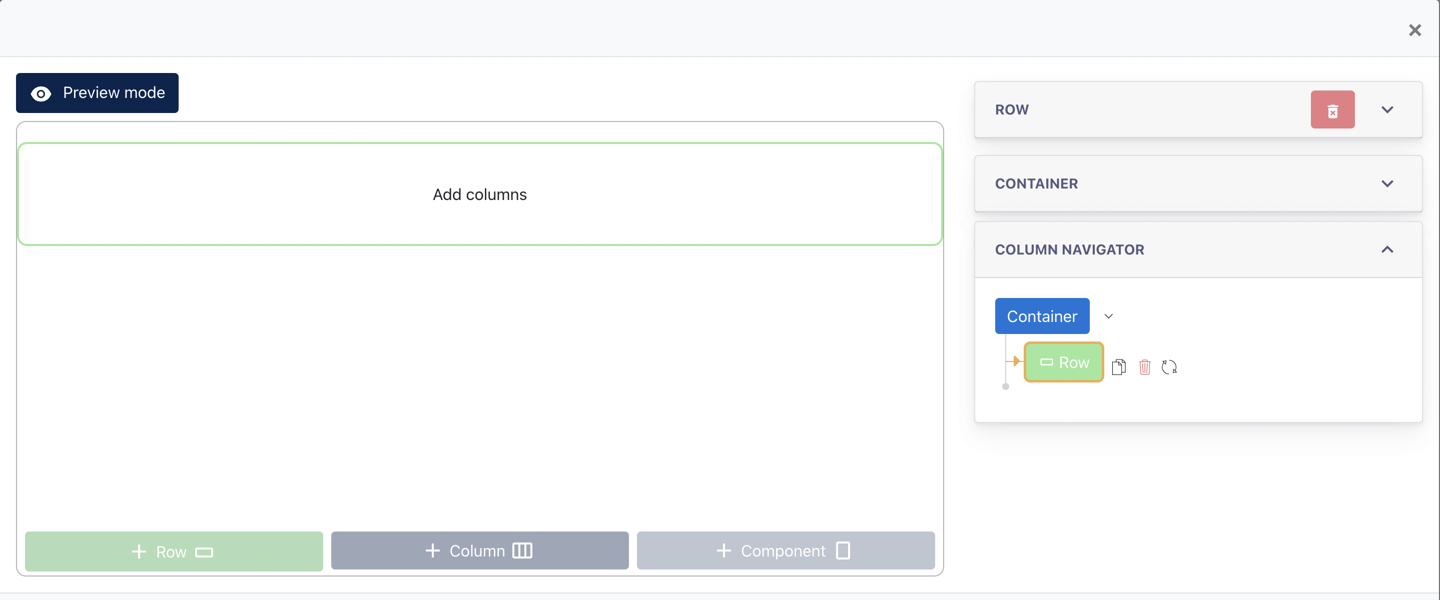
To create a blank section:
1. Click the "+" button.
2. In the Select Section dialog, click "Create Section".
Screenshot : Blank Section Editor
2.1 Understanding the Editor Structure
The Blank Section Editor is built using a hierarchical structure. Understanding these building blocks will help administrators create and manage page content more effectively.
Container
A Container is the outer wrapper of a section. It defines the overall width, spacing, background, and layout settings of the section.Row
A Row is used to organize content horizontally within a container. A section may contain one or multiple rows.Column
A Column is created within a row and defines how content is arranged across the page. Administrators can choose different column widths to create various layouts.Component
A Component is the actual content element displayed on the website. Examples include Text, Image, Video, Button, Site Form, and other available content elements.
The structure of the editor follows the hierarchy below:
Container
→ Row
→ Column
→ Component
2.2 Creating Content
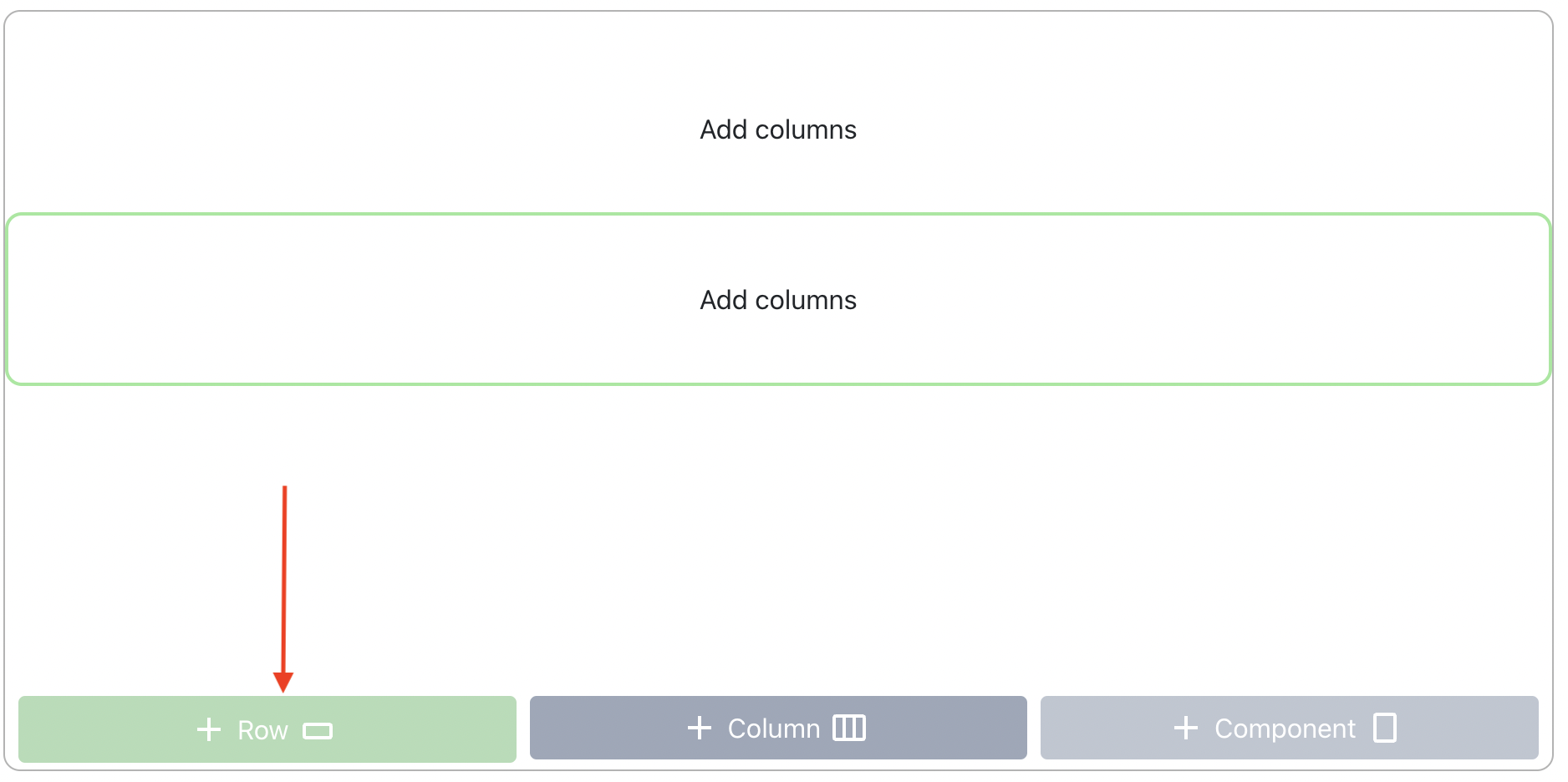
Step 1 – Add a Row
Create a row to define the layout structure of the section.
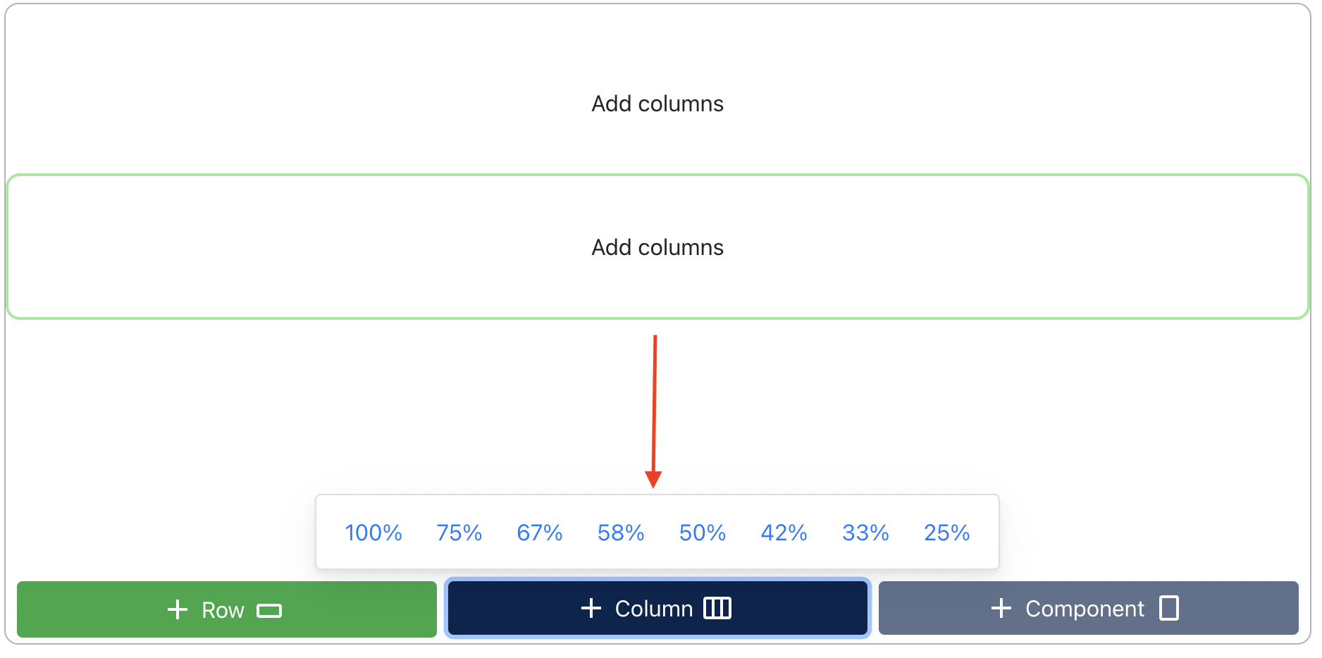
Step 2 – Define Column Width
Add one or more columns and select the desired width percentage for each column.
Step 3 – Add Components
Insert content components into the selected column.
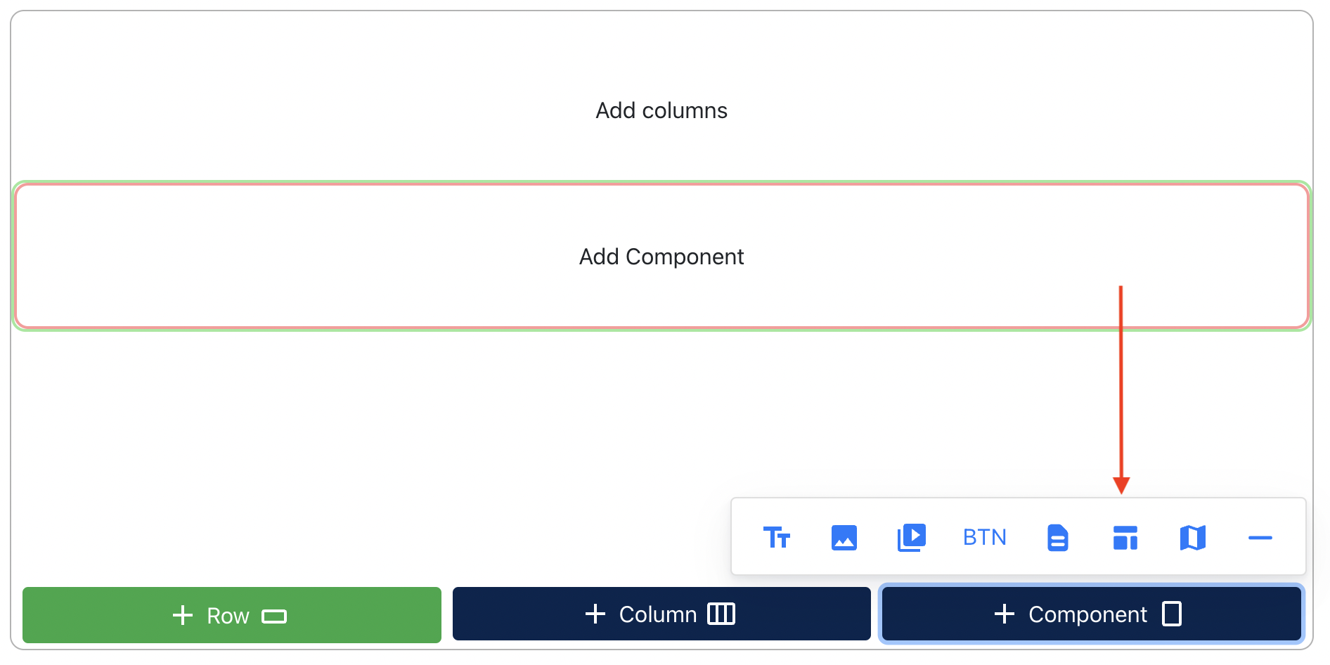
2.3 Available Components
The following components are available:
- Text
- Image
- Video
- Button
- Site form
- Template component*
- Map/embed code
- Divider
Template Components are pre-designed content elements created for more complex layouts and designs. They allow administrators to quickly insert reusable design elements without having to build them manually within the editor.
Editing Components
After a component is added, its settings are displayed in the right-side editor panel. The available settings vary depending on the selected component.
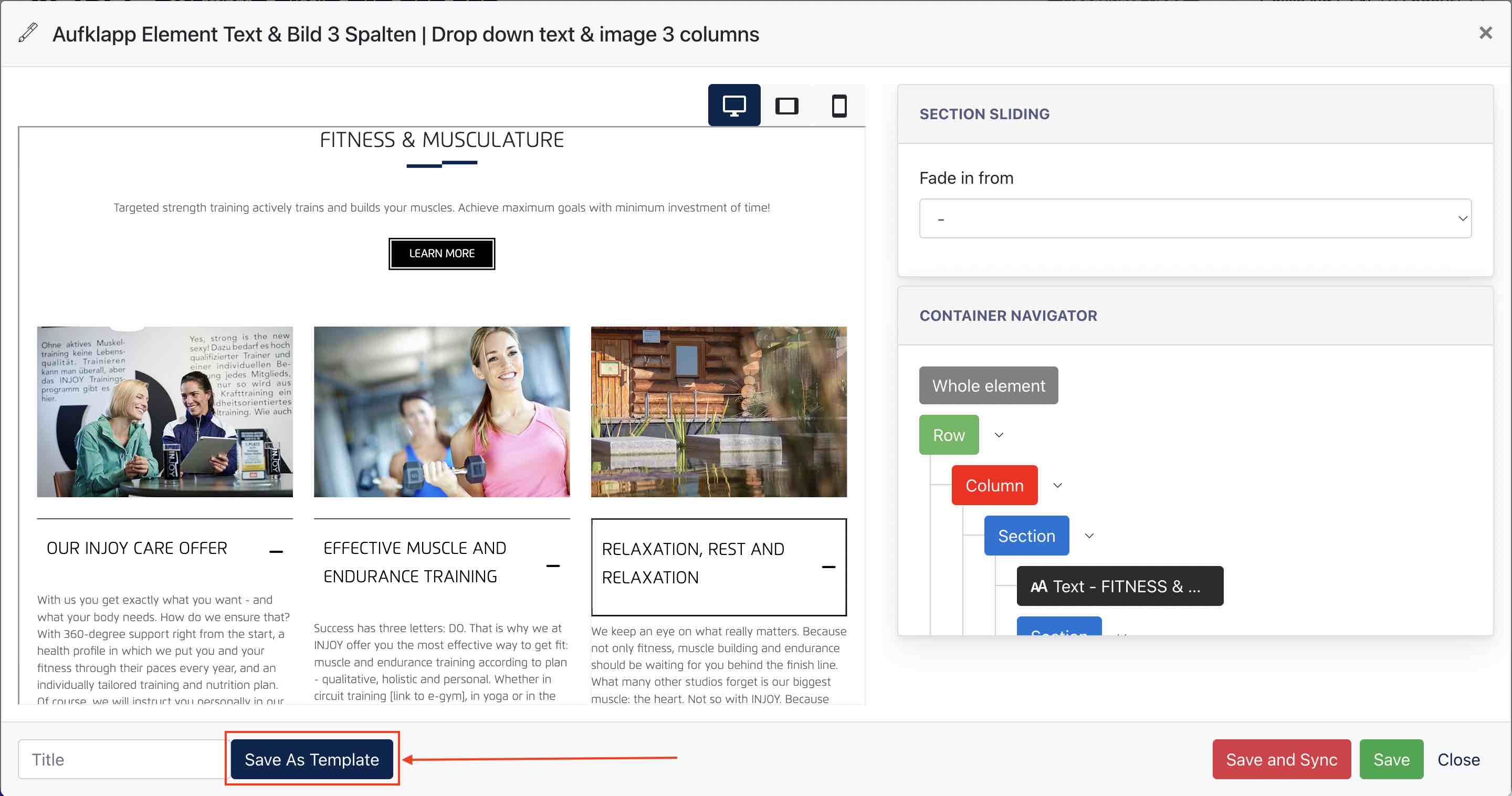
2.4 Save as Template
The Save as Template function allows administrators to save a section for future reuse.
Templates can be created from:
-
A newly created section in the Blank Section Editor.
-
An existing section that has been edited and customized.
To save a section as a template:
-
Create or edit a section.
-
Enter a template title.
-
Click Save as Template.
The template will be stored in the template library and can be reused when creating new pages or sections.
Using a Saved Template
To apply a previously saved template:
-
Click the Add (+) button within the Section Editor.
-
Select Own Sections from the template dropdown.
-
Choose the desired template from the list.
-
Apply the template to the page.
The selected template will be inserted as a new section.
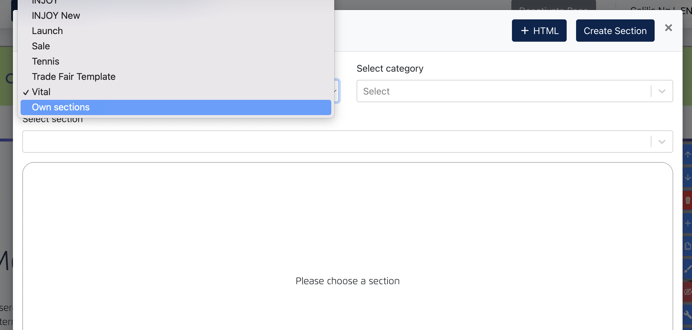
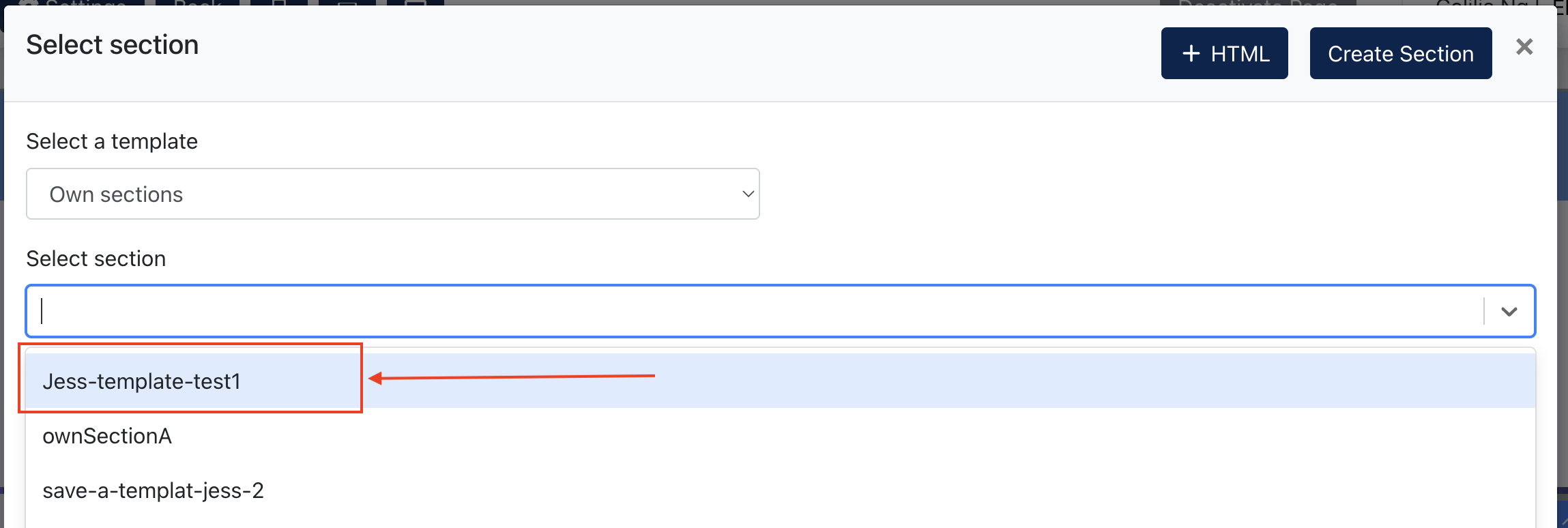
Remarks:
Own Sections are stored per website. Templates created in one website are only available within that website and will not be visible in other websites.
3. Header Editor
The Header Editor allows Center Administrators to configure the website header, including navigation menus, menu appearance, and contact information displayed on the website.
A website header is typically displayed across all pages of a website and serves as the primary navigation area for visitors.
Typical elements within a conida website header include:
Following are some examples of conida website header:


The Header Editor consists of the following configuration areas:
3.1 Edit Navigation
Center Administrators can create and manage the website navigation structure here.
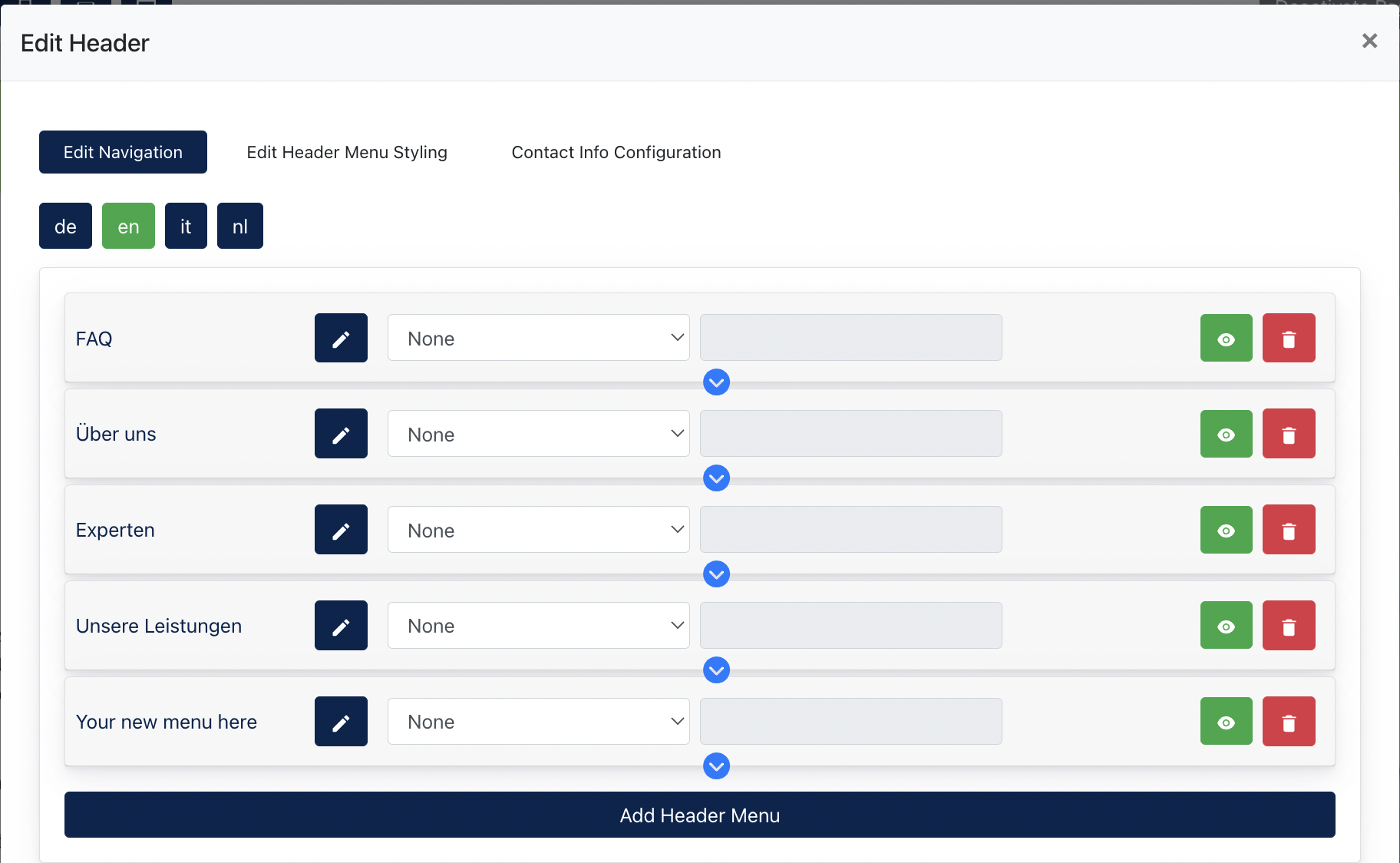
Navigation Functions
The following actions are available:
| Function | Description |
|---|---|
| Add Header Menu | Create a new top-level menu item. |
| Add Sub-menu |
Create child menu items beneath an existing menu item. The navigation menu supports up to three levels (Level 1, Level 2, and Level 3).
Sub-menu items can be created by clicking the blue arrow beneath an existing menu item. |
| Edit Menu Item | Modify the menu title and link configuration. |
| Hide Menu Item | Temporarily hide a menu item without deleting it. |
| Delete Menu Item | Permanently remove a menu item from the navigation. |
| Open in New Tab | Configure whether the linked page opens in a new browser tab. |
| Language-specific Content | Configure menu titles independently for each available language. |
Support Link Types
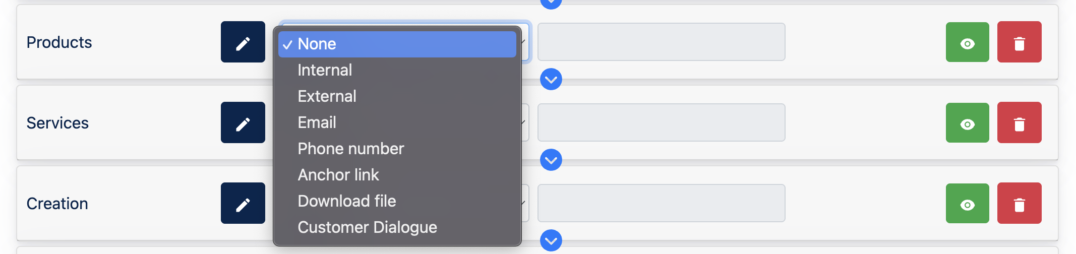
| Link Type | Description | Configuration Value |
|---|---|---|
| Internal | Links to an existing page within the current website. | Select a page from the page listing. |
| External | Links to an external website. | Enter a valid URL. |
| Opens the visitor's default email application. | Enter an email address. | |
| Phone Number | Allows visitors to initiate a phone call. | Enter a phone number. |
| Anchor Link | Links to a specific section within the current page. | Enter the anchor identifier. |
| Download File | Allows visitors to download a file. | Select a file. |
| Customer Dialogue | Opens the Customer Dialogue module for the website visitor. This option is only available when the Customer Dialogue module is enabled for the site. | Select Customer Dialogue. |
3.2 Setting up menu styling
Administrators can configure colours independently for various header sections, menu levels and device types.
Note: The illustration displayed in this tab is intended as a visual guide to help identify different header areas. It does not provide a live preview of the configured colours.
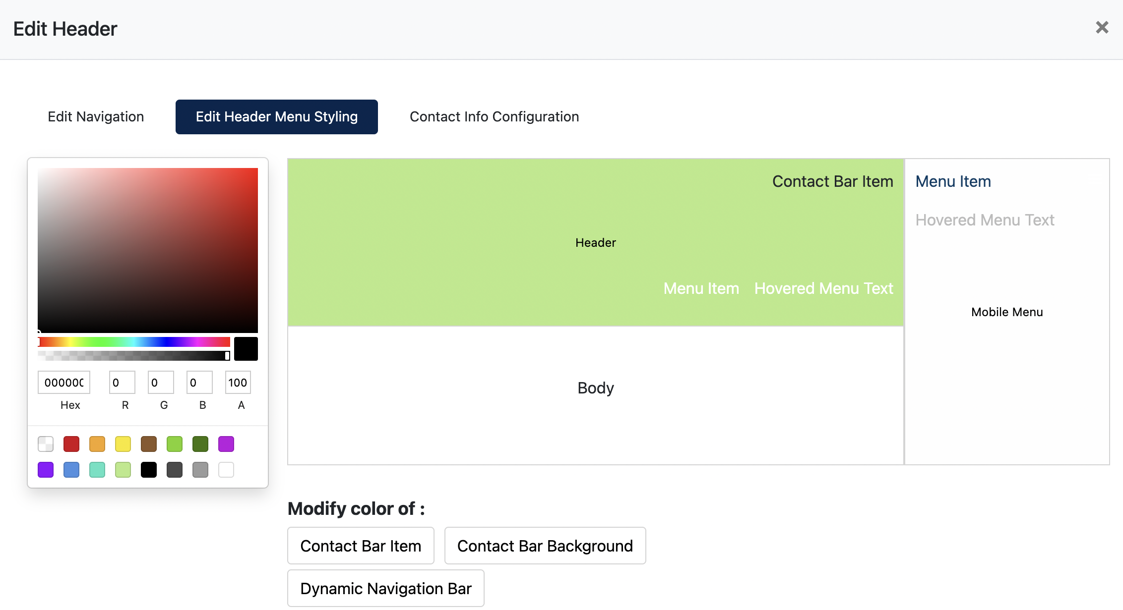
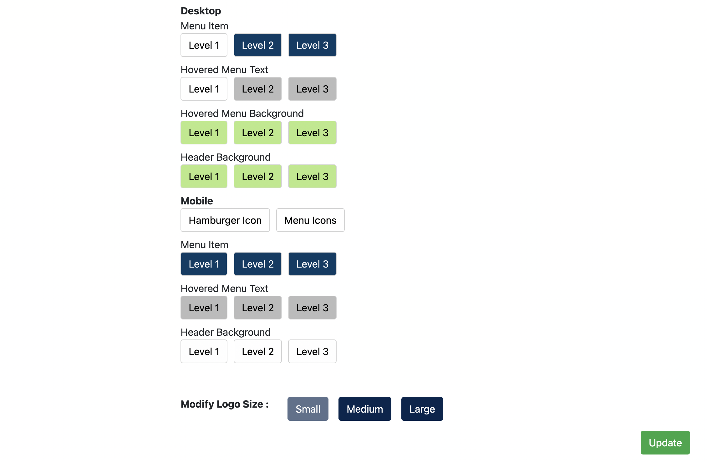
The following areas can be customised:
| Area | Description |
|---|---|
| Contact Bar Item | Configure the appearance of the content displayed within the contact bar. |
| Contact Bar Background | Configure the background colour of the contact bar. |
| Dynamic Navigation Bar | Configure the header appearance when visitors scroll down the page. |
| Desktop Menu Item | Configure desktop navigation menu styling separately for Level 1, Level 2 and Level 3 menus. |
| Desktop Hovered Menu Text | Configure the text appearance when visitors hover over menu items. |
| Desktop Hovered Menu Background | Configure the background colour displayed when visitors hover over menu items. |
| Desktop Header Background | Configure the desktop navigation bar background colour. |
| Mobile Hamburger Icon | Configure the display colour of the mobile hamburger icon. |
| Mobile Menu Icons | Configure the display colour of other icons displayed within the mobile menu. |
| Mobile Menu Item | Configure the menu item text colour for mobile navigation separately for Level 1, Level 2 and Level 3 menus. |
| Mobile Hovered Menu Text | Configure the text colour when visitors hover over mobile menu items for Level 1, Level 2 and Level 3 menus. |
| Mobile Header Background | Configure the mobile navigation background colour. |
| Logo Size | Configure the displayed size of the website logo. |
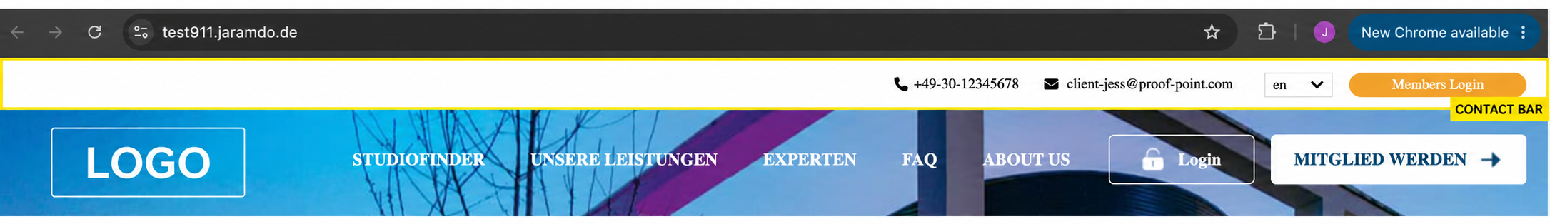
3.3 Setting up contact info
The Contact Info Configuration tab allows Center Administrators to configure the content displayed in the contact bar above the main navigation menu.
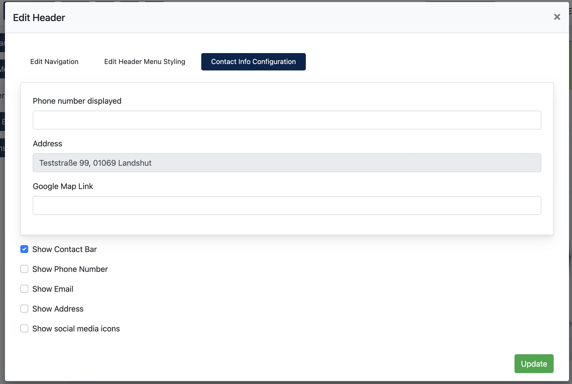
Administrators may configure the following information, which are the primary info displayed on Contact Bar
- Phone number
- Address
- Google Map link
In addition, administrators can control the visibility of the information displayed in the contact bar.
The following display settings are available:
| Display Setting | Description |
|---|---|
| Show Contact Bar | Display or hide the entire contact bar. |
| Show Phone Number | Display or hide the configured phone number. |
| Show Email | Display or hide the configured email address. |
| Show Address | Display or hide the configured address. |
| Show Social Media Icons | Display or hide the social media icons configured under Center Settings > Social Media Settings. |
Remark: The contact bar is displayed above the main navigation menu.
Example screenshot of Contact Bar :
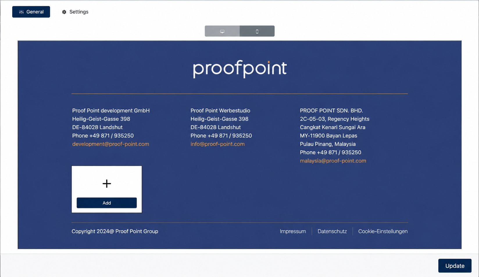
4. Footer Editor
Introduction
Common examples of footer content include:
- Company information
- Navigation menus
- Images
- Buttons
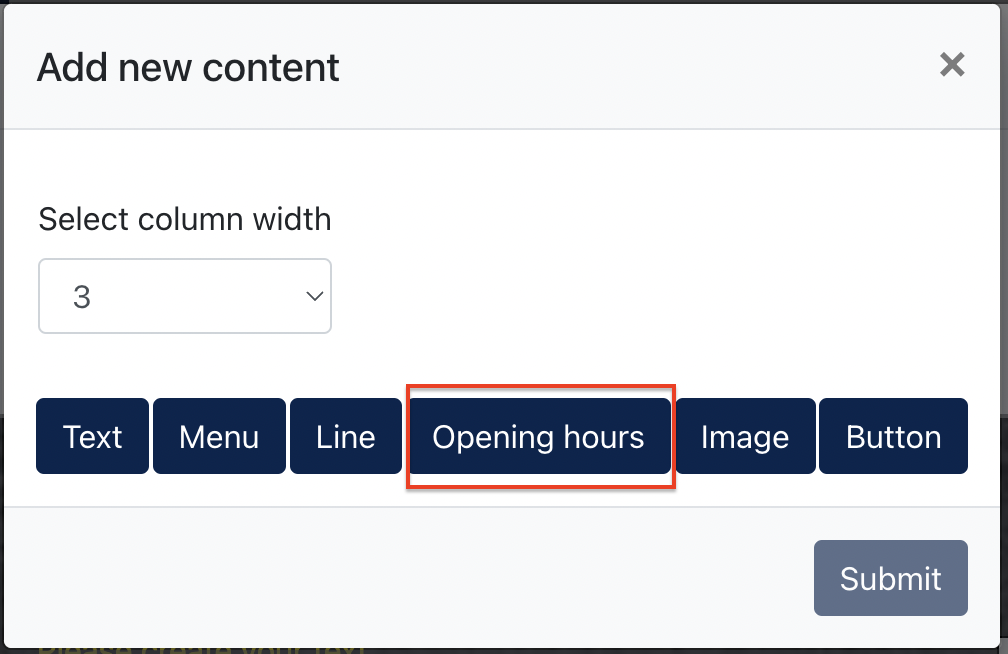
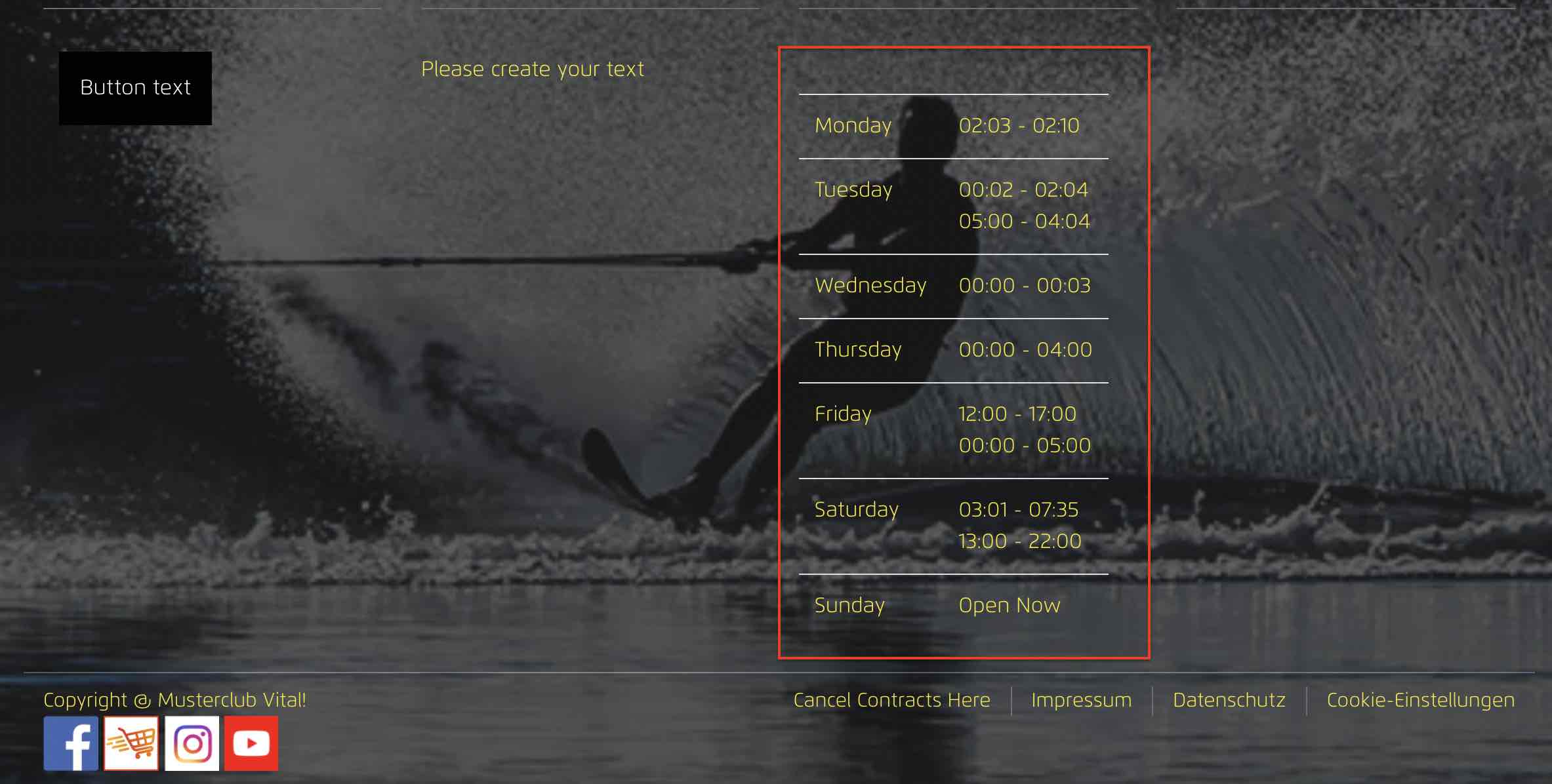
- Opening hours
- Copyright information
- Legal links (e.g. Privacy Policy, Imprint, Cookie Settings)
Live example of Footer
4.1 Editing Footer Content
To add a new footer element:
Footer Content Types
Content Type Description Text Display text-based content such as company information, addresses or copyright text. Menu Display navigation links within the footer. Line Insert a horizontal separator line. Opening Hours Display business operating hours. Image Display an image inside the footer. Button Display a clickable button linking to another destination.
Understanding Column Width
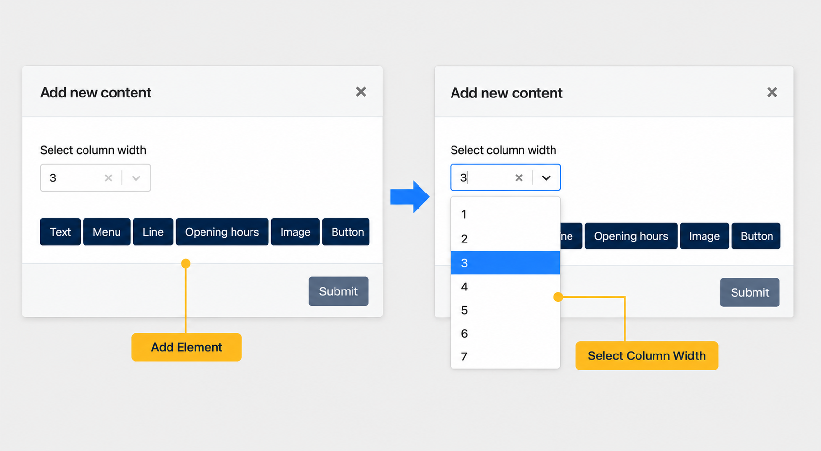
The Footer Editor uses a 12-column grid system to organise the footer layout.
When adding a new content element, administrators need to select a Column Width value.
The selected value determines how much horizontal space the element occupies within the footer.
Examples
Column Width Result 12 Occupies the entire footer width 6 Occupies half of the footer width 4 Allows up to 3 equal columns 3 Allows up to 4 equal columns Remark: The total width of all elements within a row cannot exceed 12.
4.2 Configuring Footer Elements
Below shows an example of adding an "Image" element.
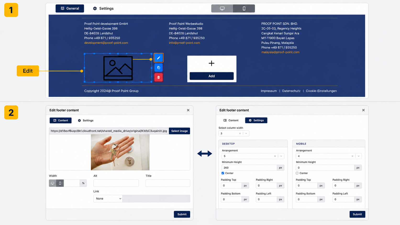
The editor consists of two tabs:
- Content
- Settings
Content
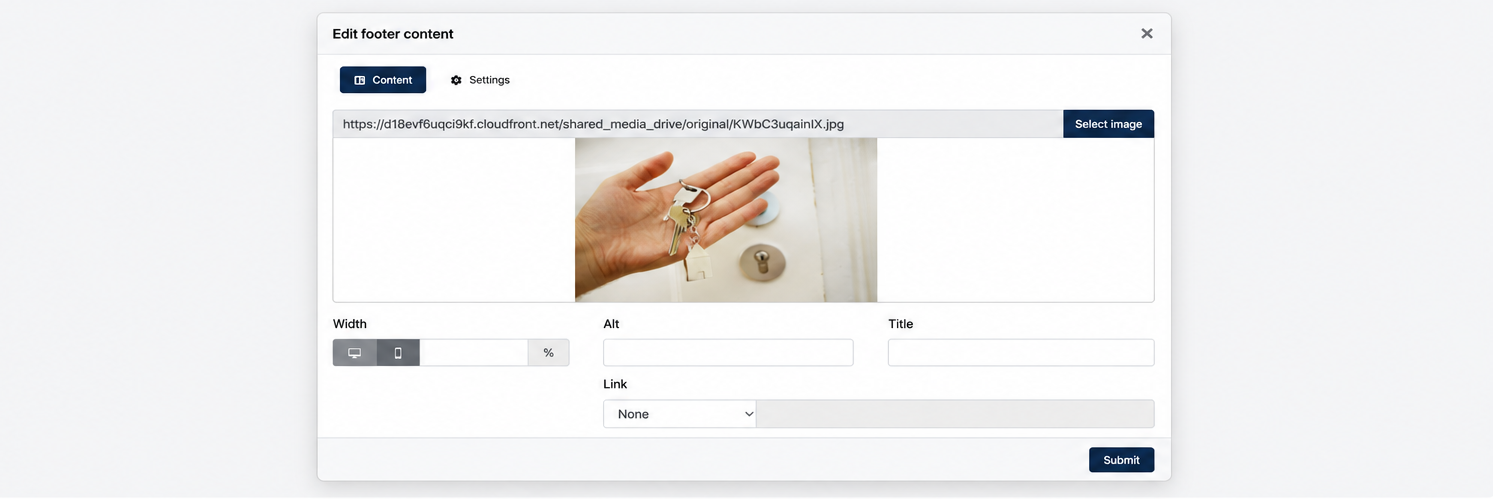
The Content tab allows Center Admin to configure the content-specific settings of the selected element.
The available configuration options vary depending on the element type selected.
For example, an Image element allows Center Admin to upload an image, configure image size, add title and alt text, and define a link destination.
Settings
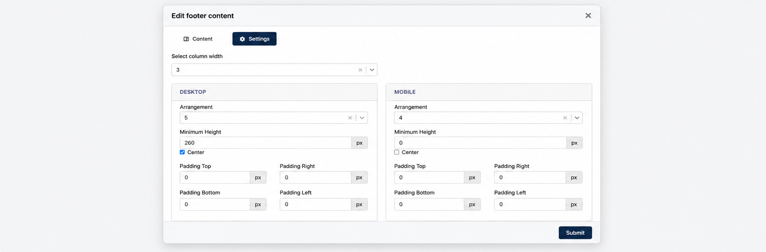
The Settings tab allows Center Admin to configure the layout and positioning of the selected element.
Unlike the Content tab, the Settings tab provides a consistent set of layout options across all footer elements, allowing Center Admin to control how each element is displayed within the footer.
The available settings are as follows:
| Setting | Description |
|---|---|
| Column Width | Modify the width occupied by the current element within the 12-column footer layout. |
| Arrangement | Define the display order of the element within the footer. Lower numbers are displayed earlier, while higher numbers are displayed later. |
| Minimum Height | Define the minimum height of the element container. |
| Center | Center-align the content within the element container. |
| Padding Top | Define the spacing above the content. |
| Padding Right | Define the spacing on the right side of the content. |
| Padding Bottom | Define the spacing below the content. |
| Padding Left | Define the spacing on the left side of the content. |
Remark: Layout settings can be configured independently for Desktop and Mobile.
Remark: The Arrangement value controls the sequence in which elements are displayed within the footer. Adjusting the value will reposition the element relative to other existing footer elements.
4.3 Setting Tab
The Settings tab allows Center Administrators to configure the overall appearance and behaviour of the website footer.
Administrators may customise the footer colours, layout width, background image and footer links.
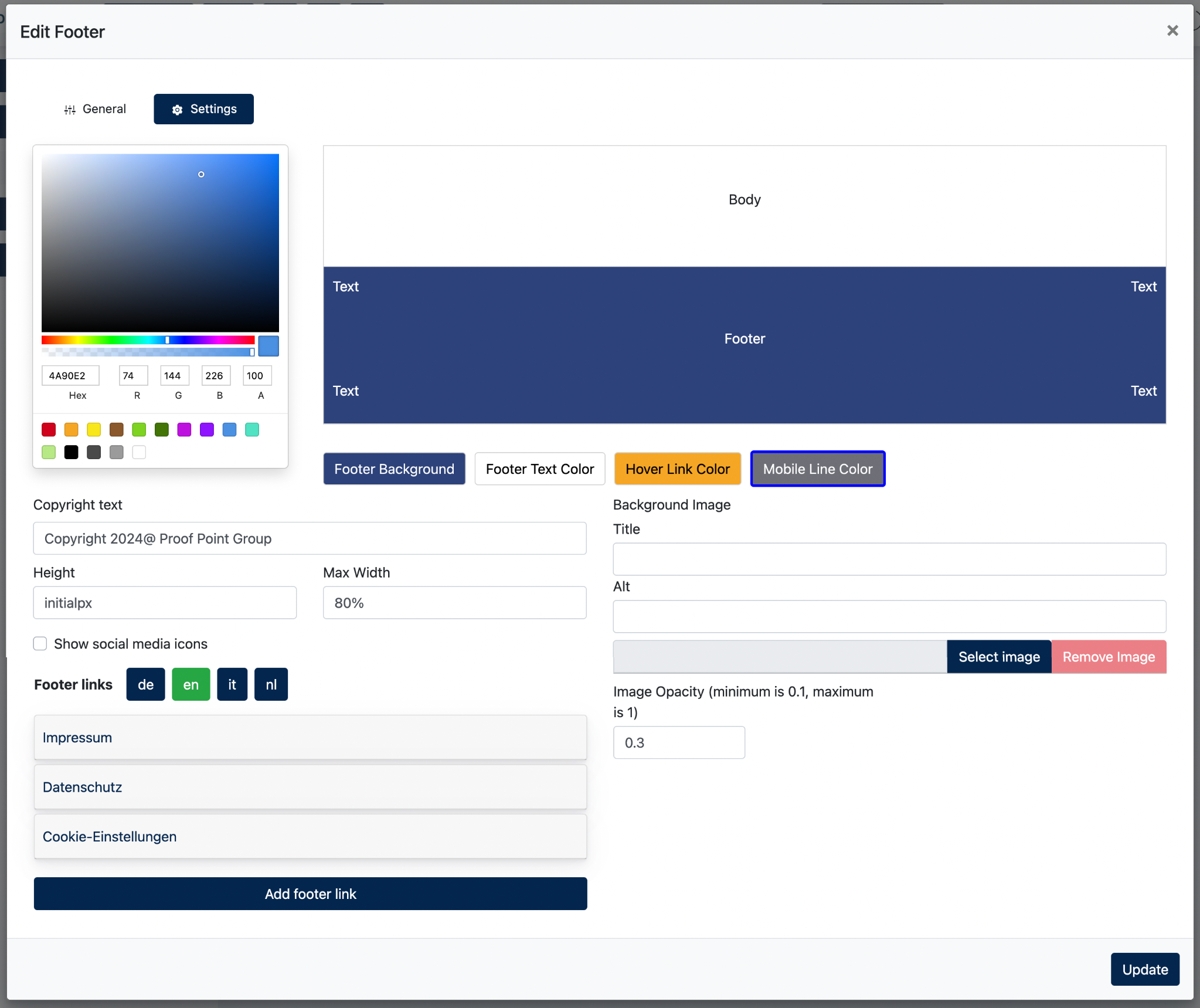
The following settings are available:
| Setting | Description |
|---|---|
| Footer Background | Configure the background colour of the footer. |
| Footer Text Color | Configure the default text colour displayed in the footer. |
| Hover Link Color | Configure the colour applied to footer links when visitors hover over them. |
| Mobile Line Color | Configure the colour of the arrow icon displayed in the mobile navigation menu. |
| Copyright Text | Configure the copyright text displayed at the bottom of the footer. |
| Height | Configure the overall footer height. |
| Max Width | Configure the maximum width occupied by the footer content. The default value is 80%. Larger values will allow the footer content to expand closer to the left and right edges of the page. |
| Show Social Media Icons | Display or hide the social media icons configured under Center Settings > Social Media Settings. |
| Background Image | Configure a background image for the footer. |
| Image Opacity | Configure the transparency level of the footer background image. |
Footer Links
5. Scroll Buttons
5.1 Overview
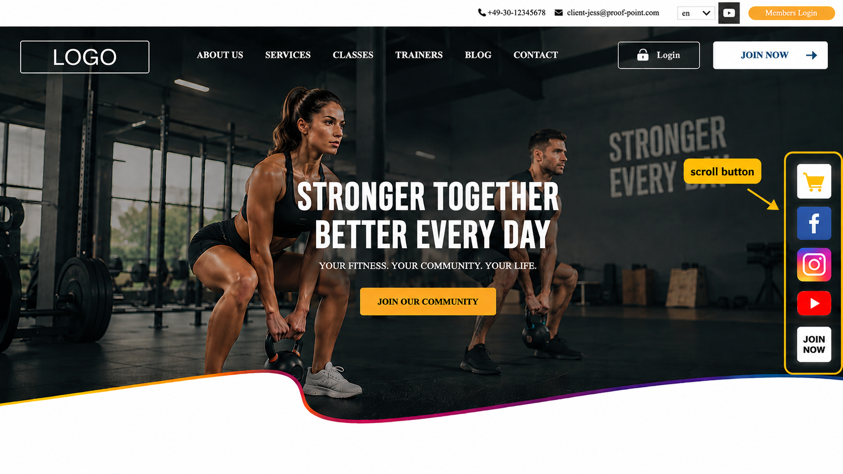
Multiple scroll buttons can be displayed simultaneously. Their display order can be controlled using the position setting.
Several predefined scroll buttons may already exist depending on the website configuration. These buttons can be modified, reordered or removed if required.
5.2 Managing Scroll Buttons
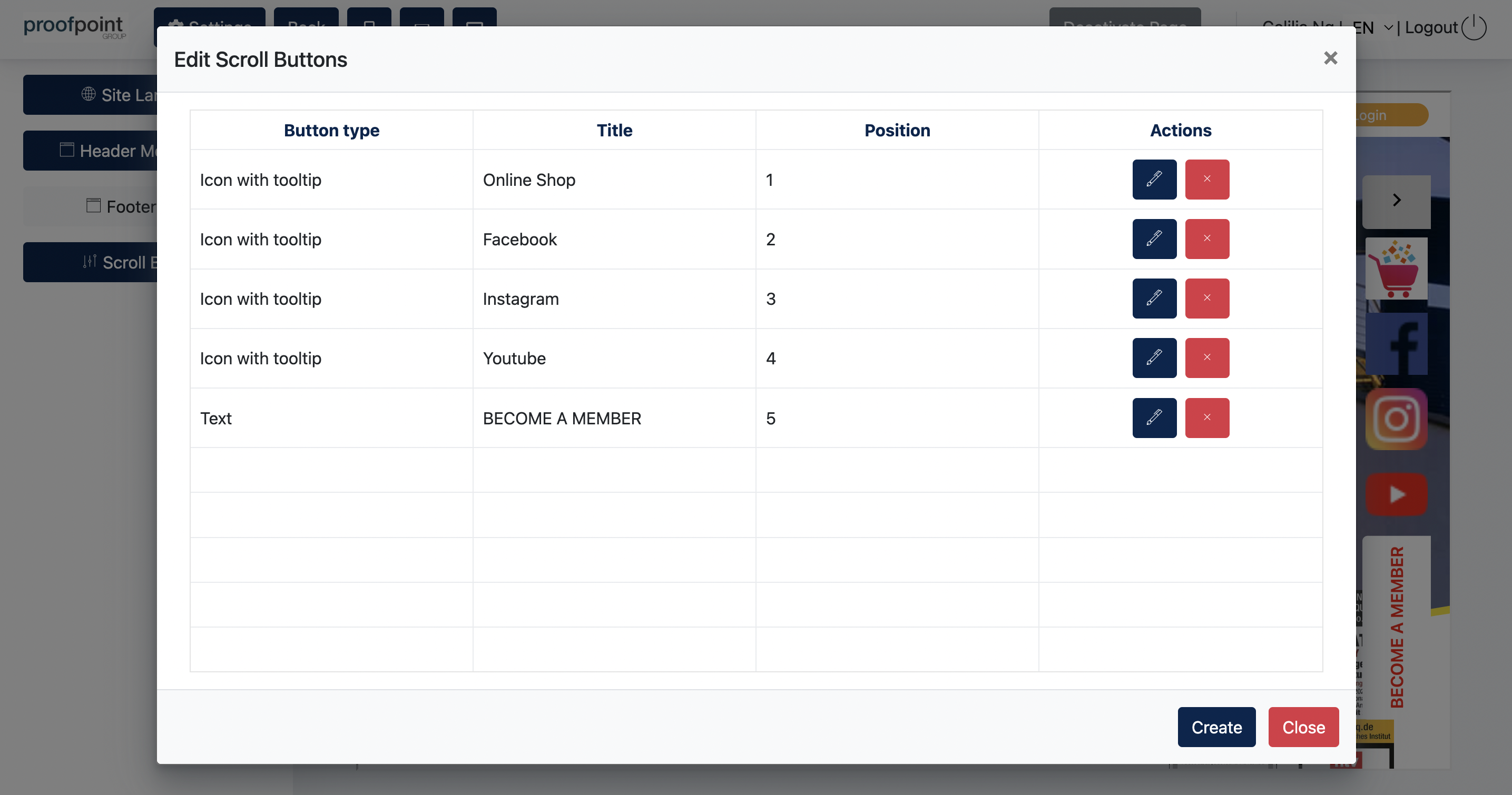
The Edit Scroll Buttons window displays all configured scroll buttons available for the website.
Center Administrators may create, edit or delete scroll buttons from this page.
Each row represents one scroll button configuration.
The Position column determines the display order of the scroll buttons on the website. Smaller numbers appear first.
Example:
5.3 Configuring a Scroll Button
Click Create to add a new scroll button.
Note: Editing an existing scroll button uses the same configuration screen as creating a new one. Simply click the Edit icon to modify an existing scroll button.
1. [ General Tab ]
Configure the content, behaviour and display settings of the selected scroll button.
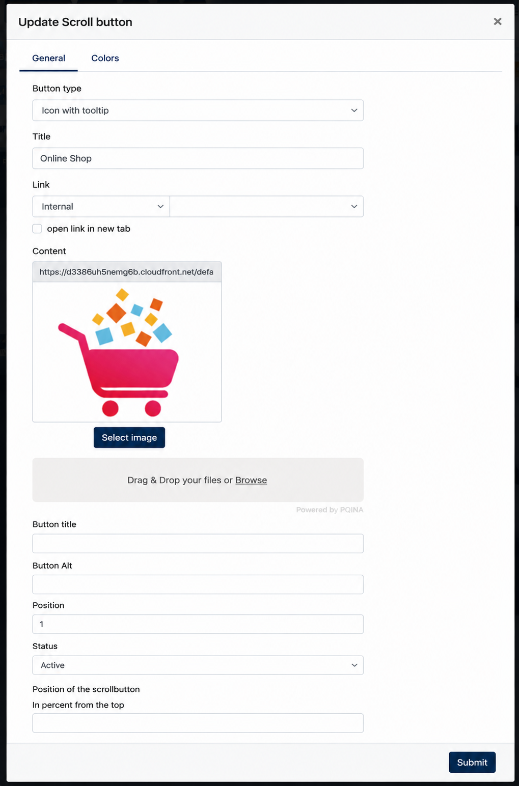
The following settings are available:
| Field | Description |
|---|---|
| Button Type | Determines how the scroll button is displayed. |
| Title | Defines the title of the scroll button. |
| Link | Configures the destination page or external URL. |
| Open link in new tab | Opens the destination link in a new browser tab. |
| Content | Uploads an image or icon to be displayed on the scroll button. |
| Button Title | Defines the title shown for the button. |
| Button Alt | Defines the alternative text used for accessibility purposes. |
| Position | Determines the display order of the scroll button. Smaller numbers appear first. |
| Status | Enables or disables the scroll button. |
| Position of the scroll button | Configures the vertical position of the button on the website (in percentage from the top). |
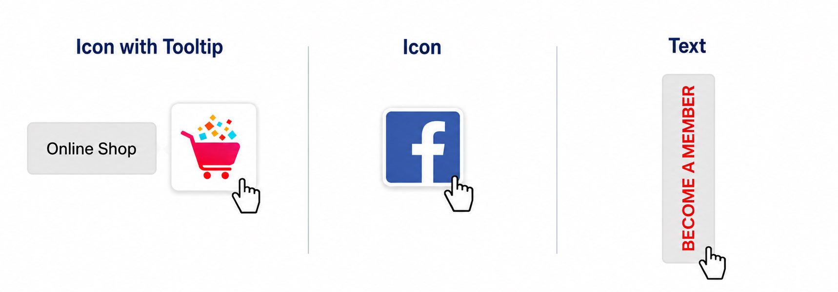
2. [ Button Types ]
| Button Type | Description |
|---|---|
| Icon | Displays an icon only. No text is shown when users hover over the button. |
| Icon with tooltip | Displays an icon and shows additional text when users hover over the button. |
| Text | Displays a text button without an icon. |
5.4 Configuring Scroll Button Colors
[ Colors Tab ]
The Colors tab allows Center Administrators to configure the appearance and colours of the selected scroll button.
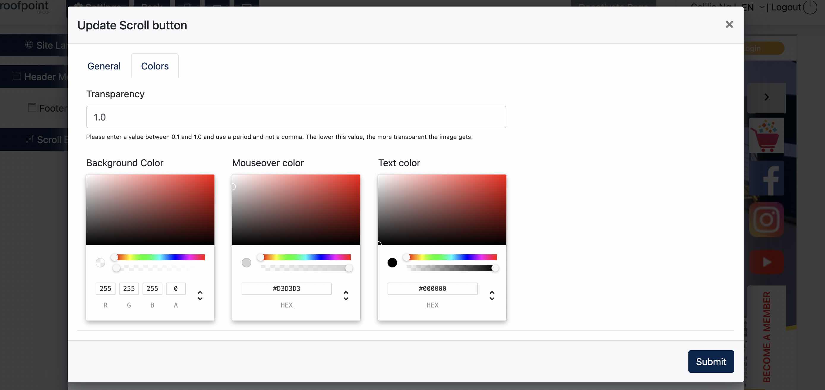
The following settings are available:
| Setting | Description |
|---|---|
| Transparency | Configures the transparency level of the scroll button. Lower values increase transparency. |
| Background Color | Configures the default background colour of the scroll button. |
| Mouseover Color | Configures the background colour displayed when users hover over the button. |
| Text Color | Configures the text colour displayed on the button. |
6. Opening Hours
Under Site Content > Opening Hours, Center Admin may configure the opening hour using the text editor.
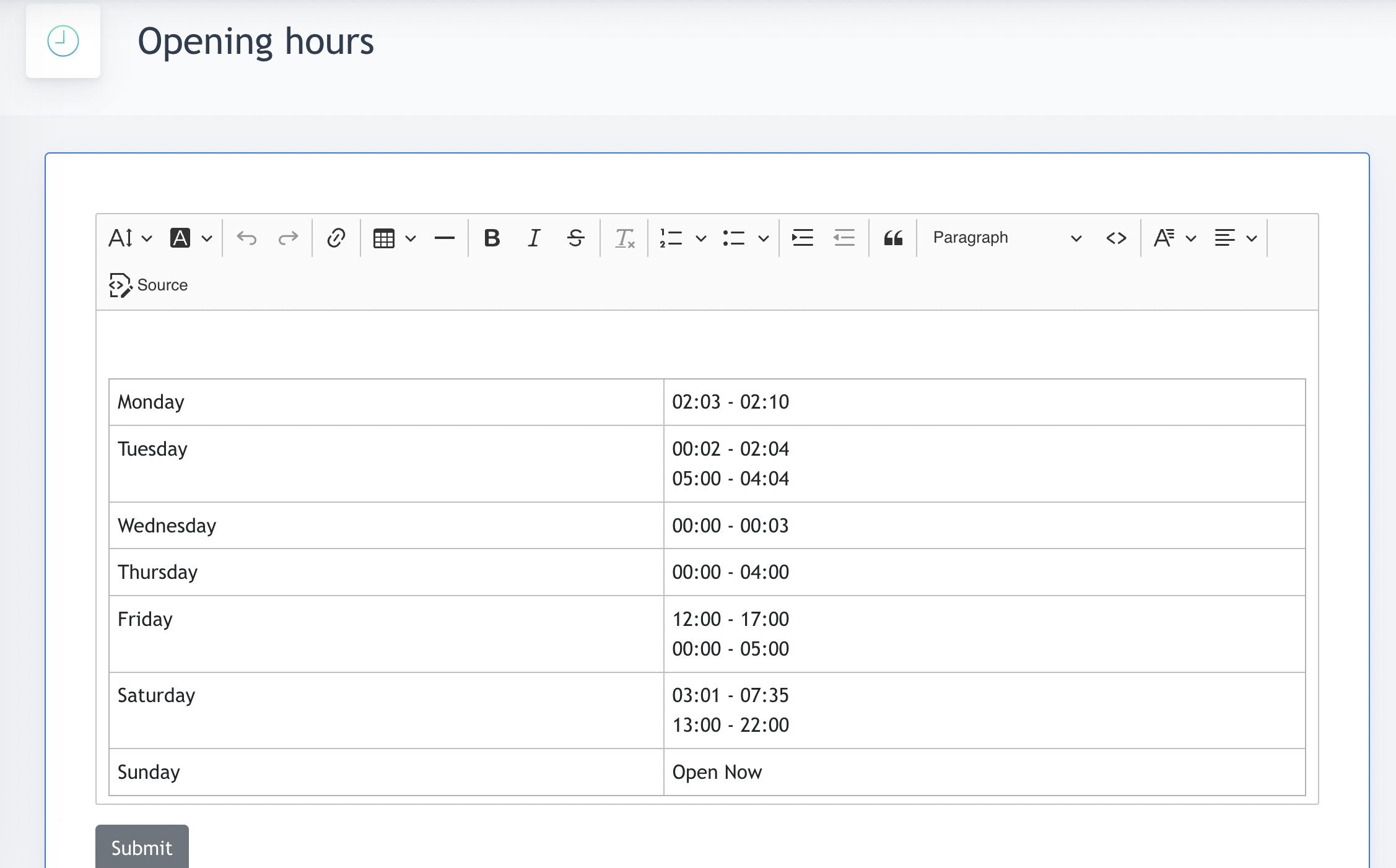
6.1 Opening Hour at Footer
This opening hour will appear under Footer, if this component is added by Center Admin.
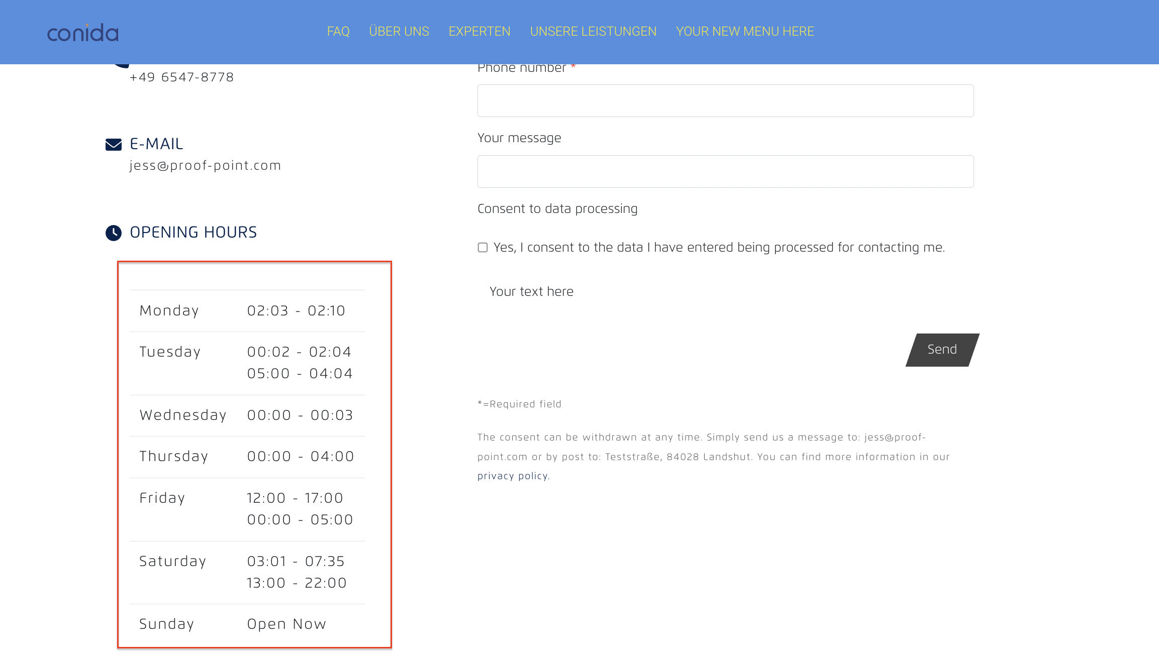
6.2 Opening Hour at Contact form
This opening hour will also be displayed under every conida's standard contact form's template :
- the end -